Grazing Season
Overview:
Grazing Season is an application that allows users to find local farms who practice a sustainable farming philosophy and sell their products to the community to create a better food system.
My Role:
All UX documentation to include user research, sitemap, user flow, competitive analysis, design comps, interaction design, and CSS specs.
Tools:
Adobe Photoshop CC, Adobe Illustrator CC, and Adobe InDesign CC
Discovery Phase
Before starting the UX portions of this project we conducted a competitive analysis to gain a better understanding of the sites that already exist in the current market, as well as surveys to understand who our users might be.
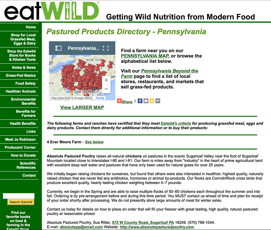
- Detailed list of all farms in selected state
- The map is too small
- There is no search for farms by city or zip code
- User has to go to a new page to find farms in their area
Pros:
Cons:
Personas & Experience Map
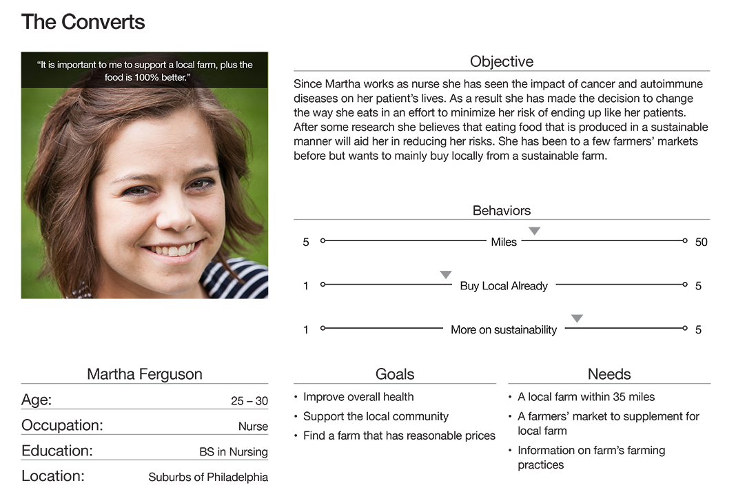
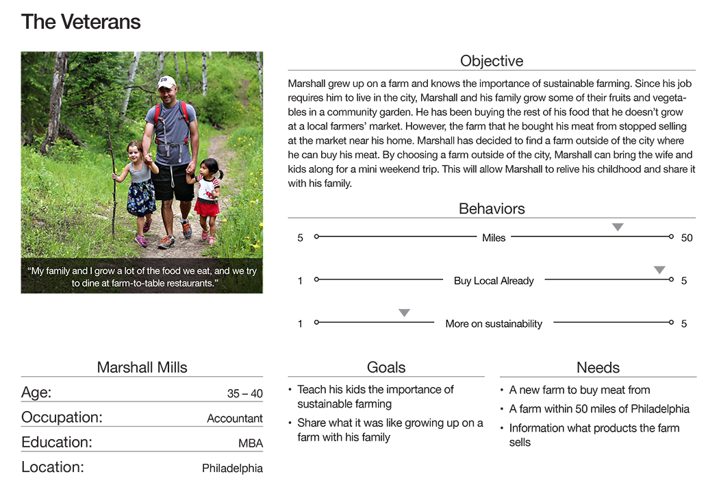
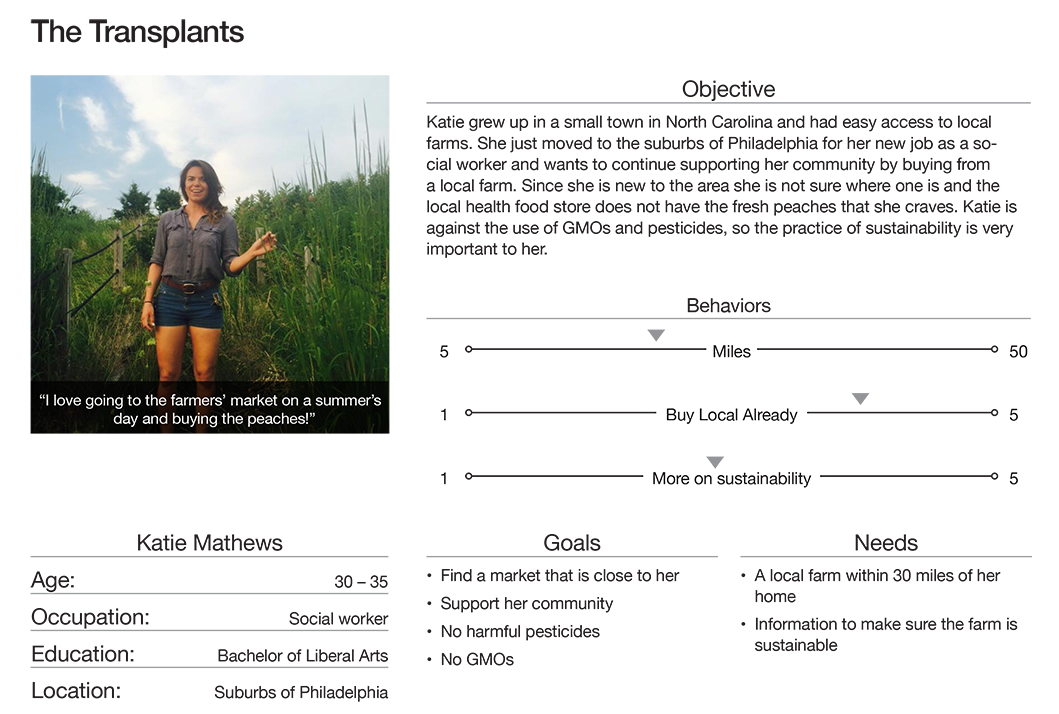
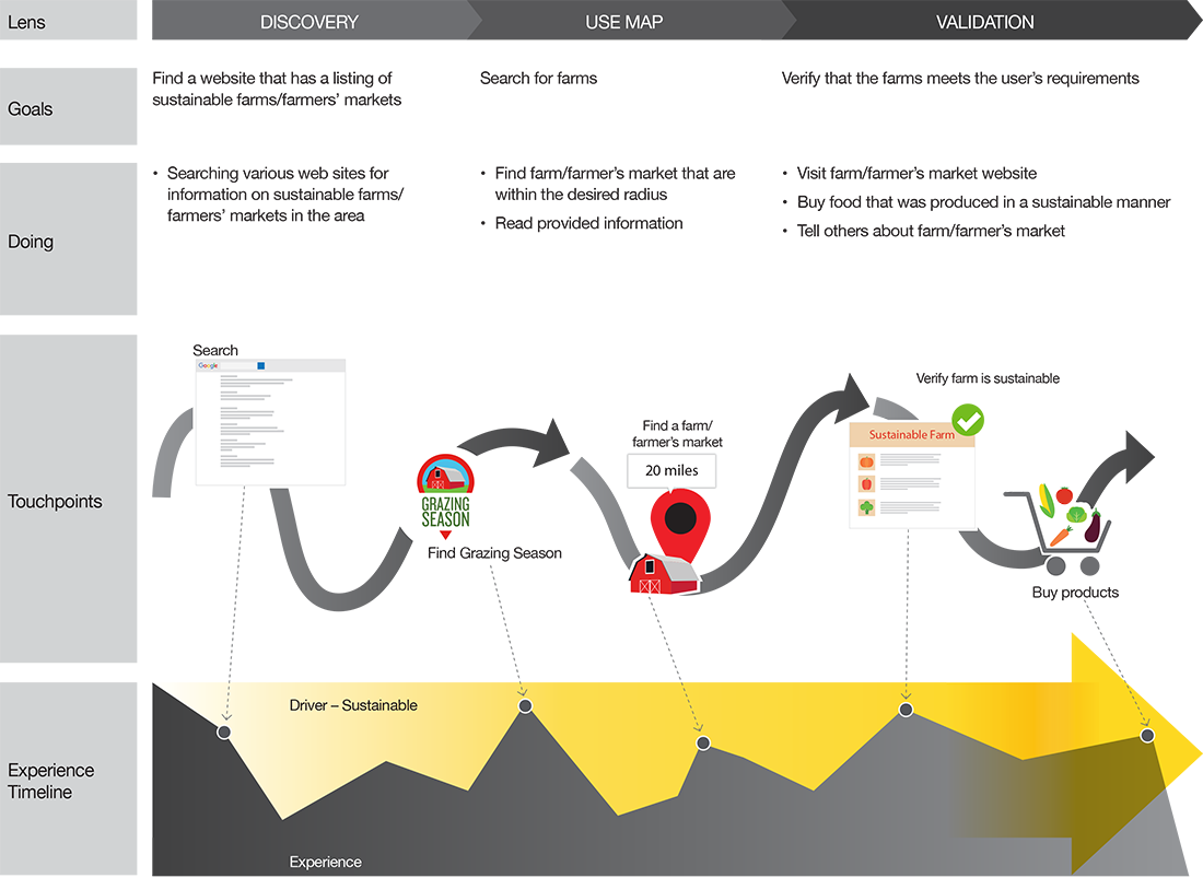
From the research found in the discovery phase, three personas were developed. The Converts: users who recently discovered the farm-to-table movement. The Veterans: users who have been involved with the movement for a few years. Lastly, The Transplants: users who have relocated to a new area and wanted to find a local farm. These personas aided in the making of informed design decisions throughout the process.
Wireframes & Visual Design
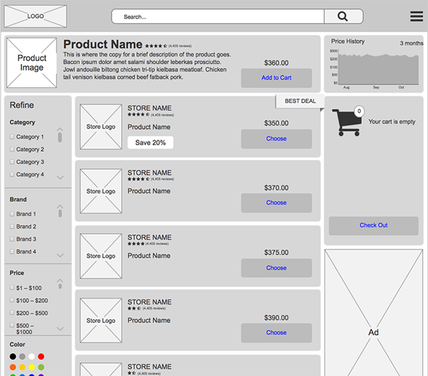
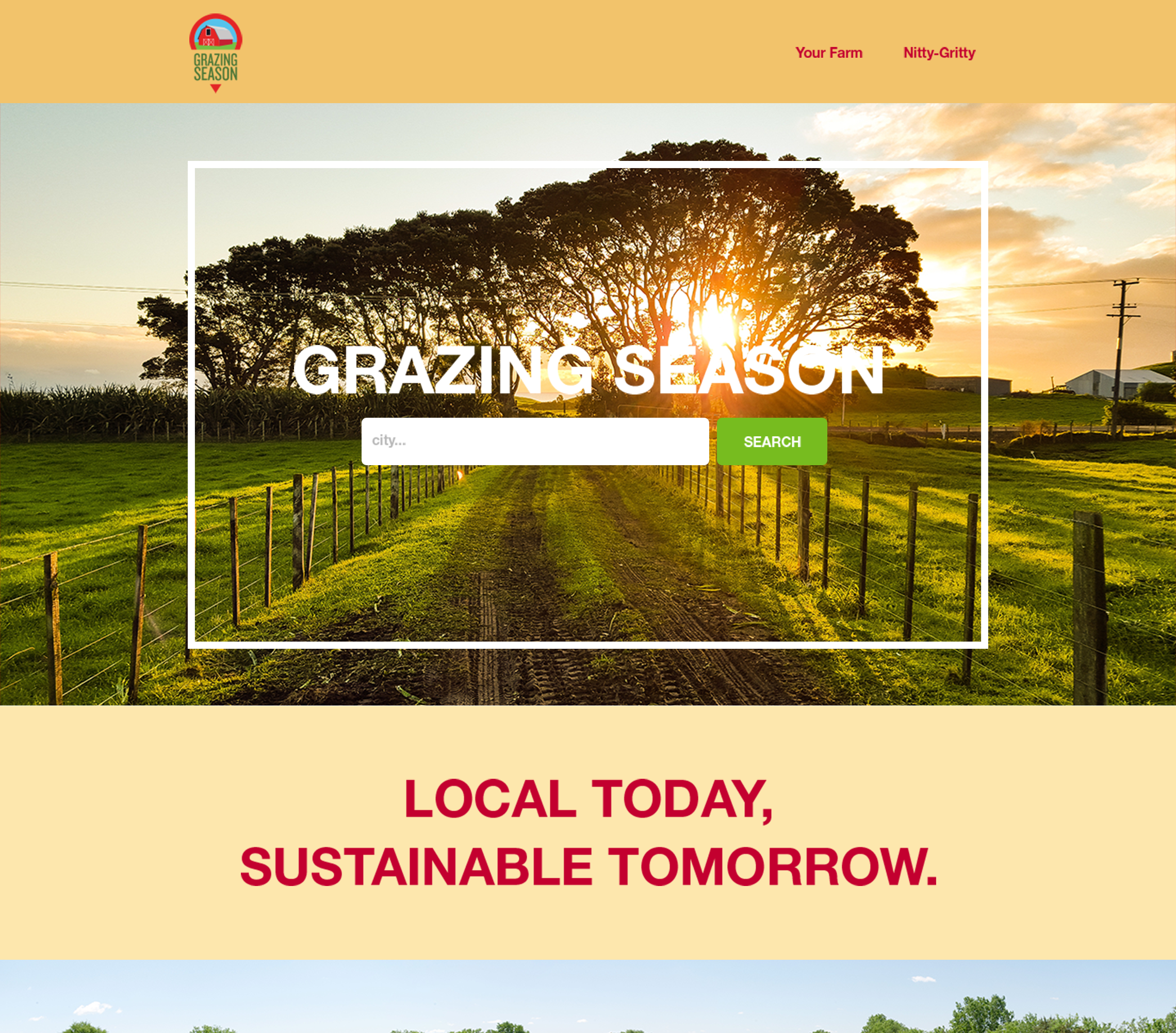
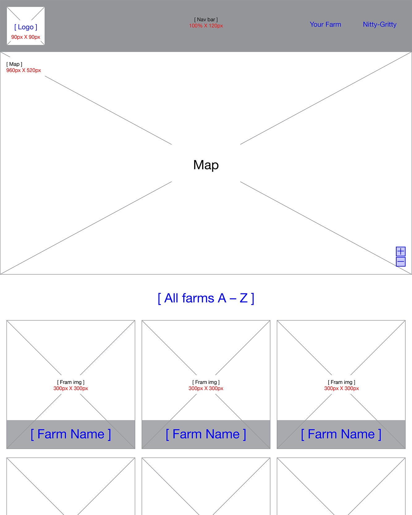
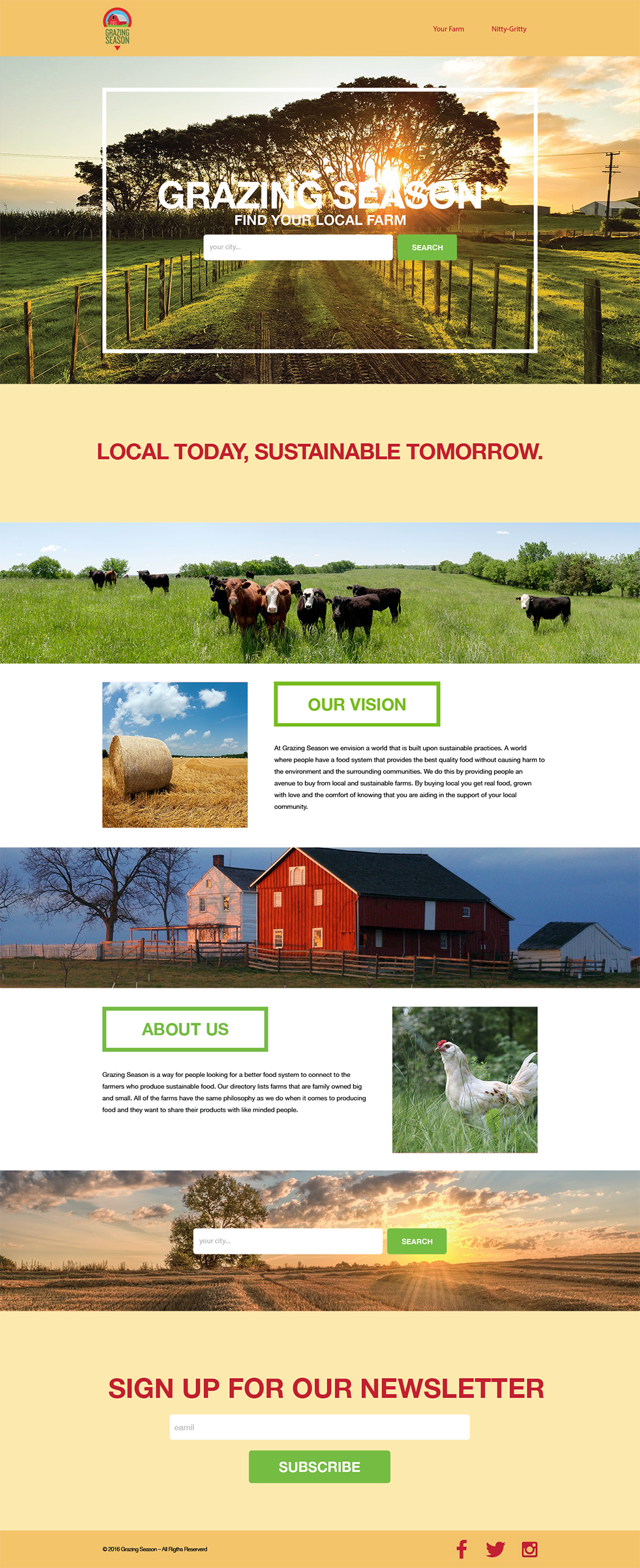
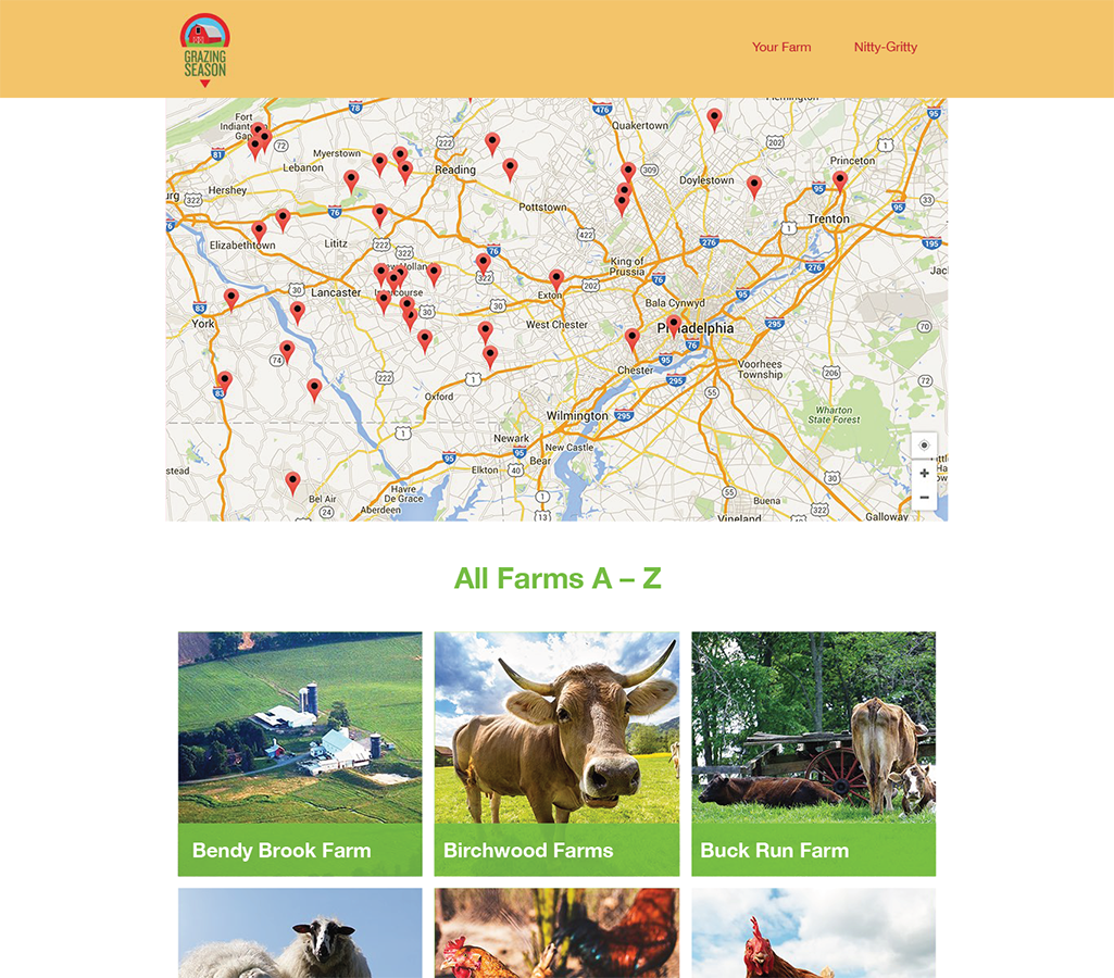
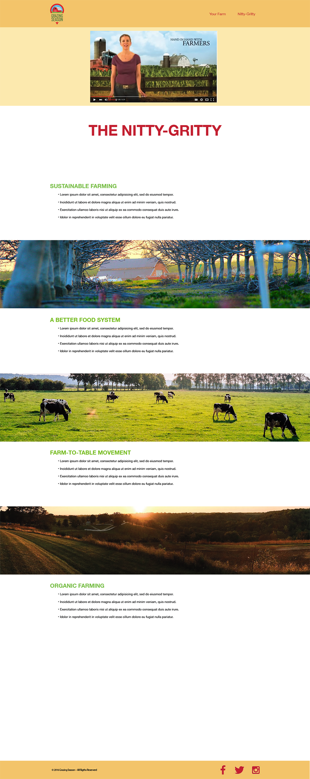
The wireframes encompass all three persona types needs. The wireframes were designed with a mobile-first approach and specifications for development are highlighted in red. The visual design for Grazing Season is meant to convey the feeling a user might associate with a farm. The colors are meant to be warm with accents of green and red, like colors one might see on a farm. The imagery supports this feeling by having photos of farm animals that are grazing in open fields and images that reflect a sustainable farm life.
Landing Page

Your Farm Page
Nitty Gritty Page

Landing Page
Your Farm Page
Nitty Gritty Page
Summary
Being able to empathize with the users helps in understanding their goals and motivations. This understanding plays a role in identifying how the users interact with the product; thus, influencing the overall design.

