Exploring Craft Beers
A Study on Data Visualization
Overview:
Exploring Craft Beers is a journey into the world of data. This project was an independent study that centered around the process of visualizing data. With the sole purpose of understanding how to tell a story through the use of the data, and how to make that story visually engaging to the viewer.
My Role:
Learn the theories and fundamentals of data visualization, design and build the prototypes.
Tools:
Microsoft Excel and Axure RP Pro
Discovery Phase
The purpose of the independent study started out as a course to learn how to program interactive data visualization interfaces by using methods and techniques to enhance a user’s understanding and ability to analyze complex data. To create the interactive interface, I needed to learn the JavaScript library D3.js and apply the fundamentals and theories of data visualization to create a compelling visualization.
However, my independent study advisor Jason Prunty felt that focusing on the fundamentals of telling a story with data would be more beneficial. This resulted in the independent study shifting away from learning how to visualize data in D3 to using hand-drawn visualizations, similar to Dear Data by Giorgia Lupi and Stefanie Posavec. However, I chose to learn D3 anyway in hopes of using the library in future projects.
First Data Set
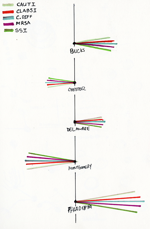
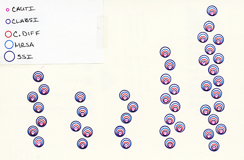
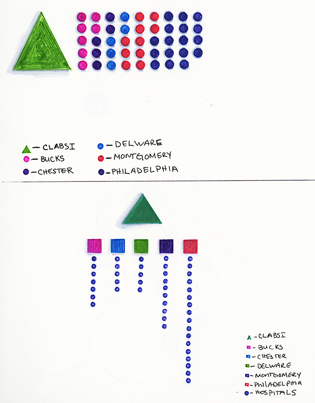
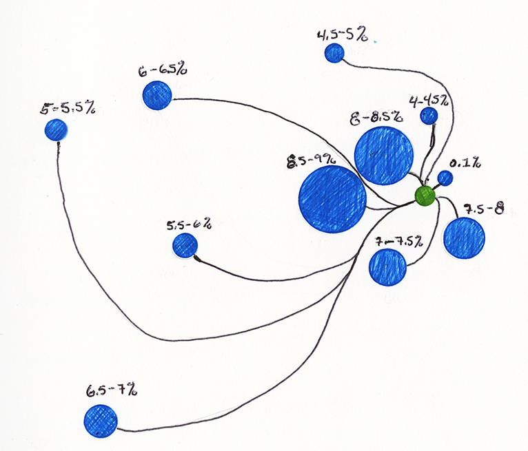
The first dataset that I tried to visualize dealt with healthcare-associated infections (HAI) on a national level. Using Excel, I broke the dataset down to the main HAI causes, catheter-associated urinary tract infection (CAUTI), central line-associated bloodstream infection (CLABSI), C.diff, MRSA, and surgical site infection (SSI). As compelling as the dataset is, it lacked the appropriate information needed to find an exciting story to tell. Combining that with my design choices for the visualizations, all being arbitrary, they ended up failing.
Second Data Set
After discovering that the first dataset wasn't suitable for the independent study and under the guidance of my advisor, I decided to search for a new dataset. I found a dataset on Kaggle from Jean-Nicholas Hould that dealt with craft beers. Using Excel, I was able to filter and mine the data by adding in missing information and narrowing down interesting ideas such as average number of Alcohol By Volume (ABV), and the total number of beers and breweries. From these ideas and constant iterations, I designed various visualizations that depicted the story I wanted to tell. However, they still were not very compelling because I was again making arbitrary design decisions.
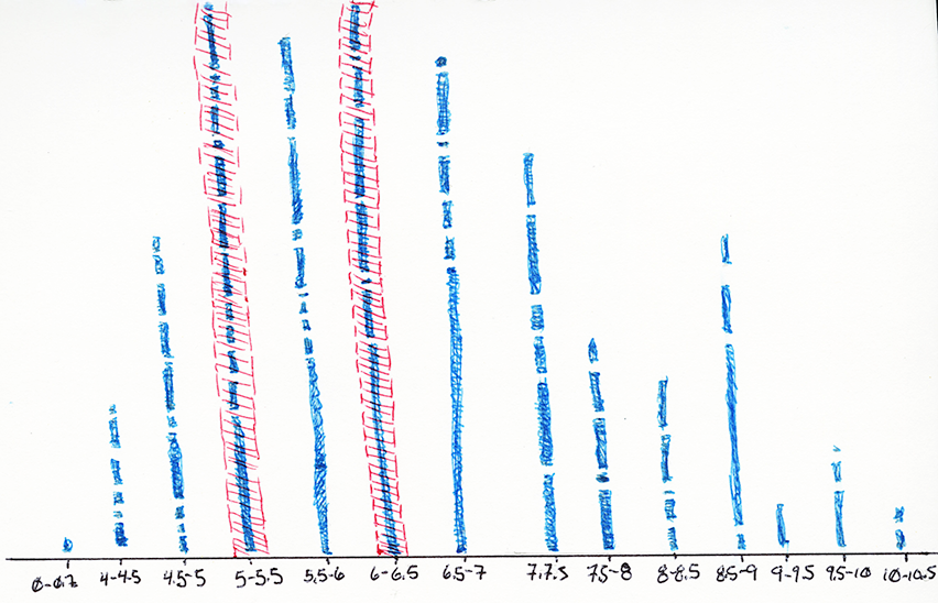
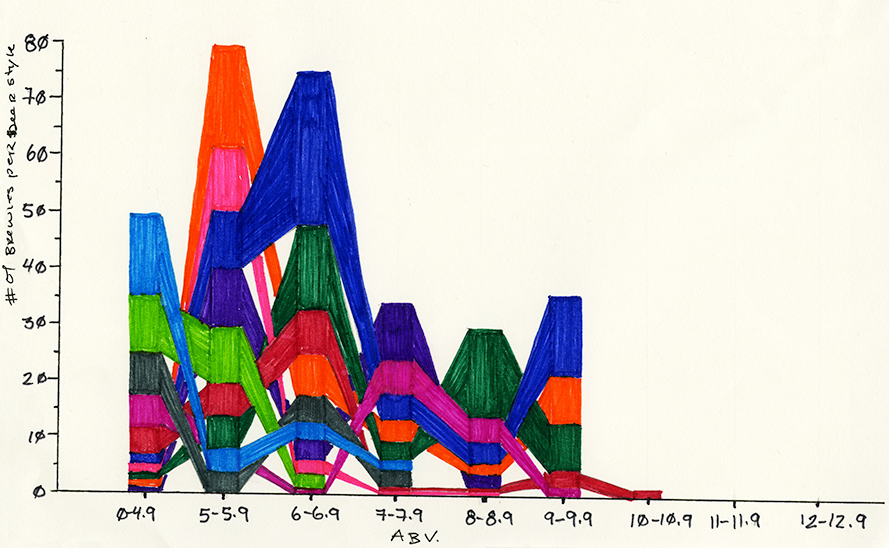
Round One
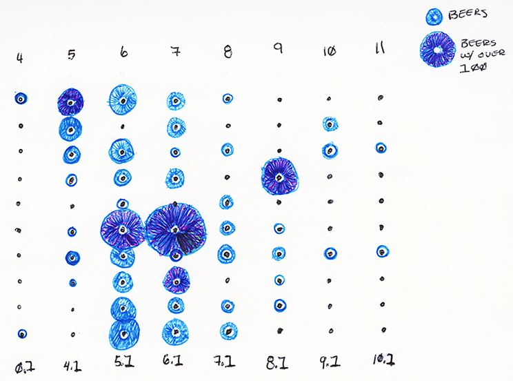
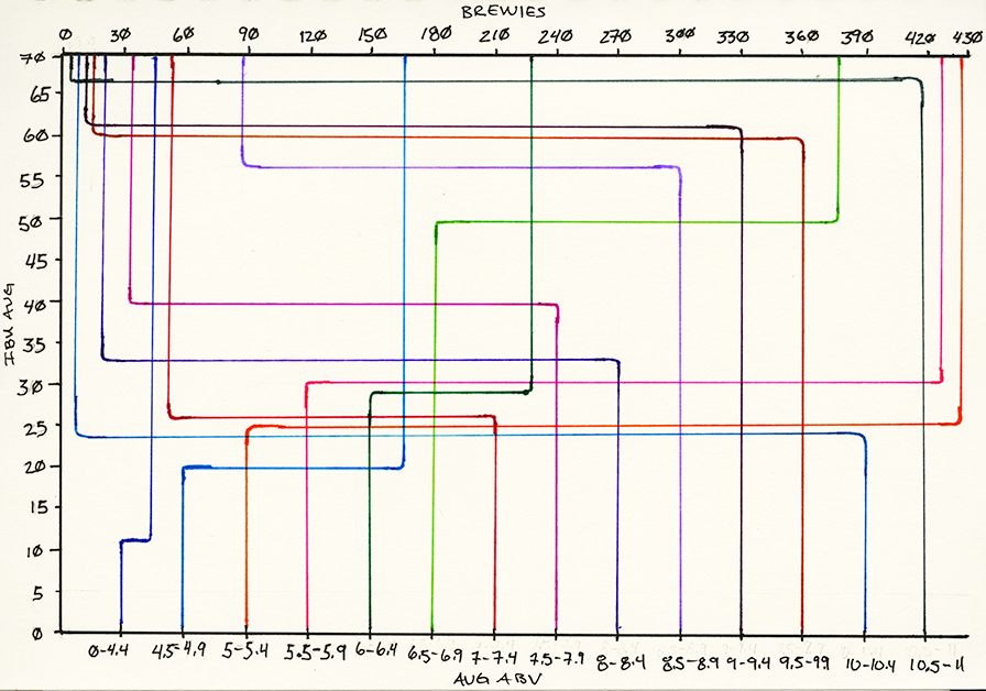
Round Two
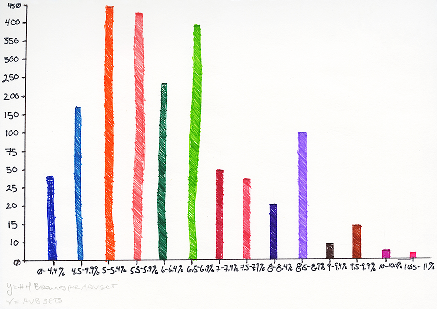
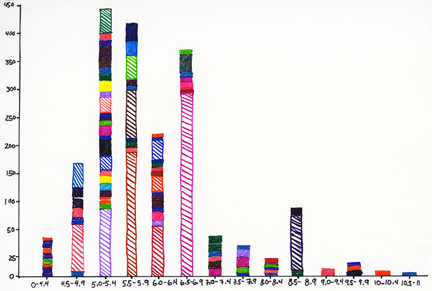
Final Data Visualizations
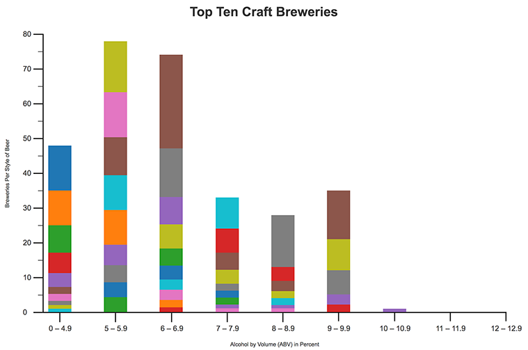
Using the last two hand-drawn visualizations from the second iteration, I developed the final data visualizations that would be used in building two prototype concepts. Unlike the rest of the visualizations, these told a compelling story, were visually engaging and had no subjective design decisions other than the color palette.
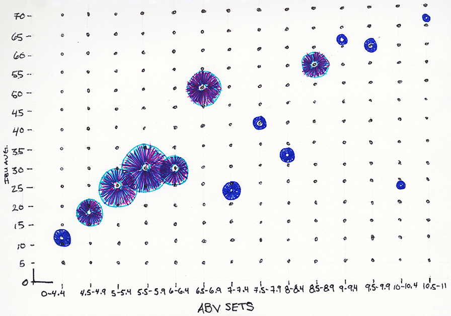
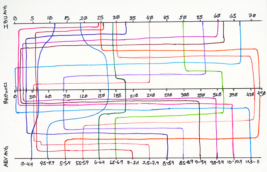
Prototype
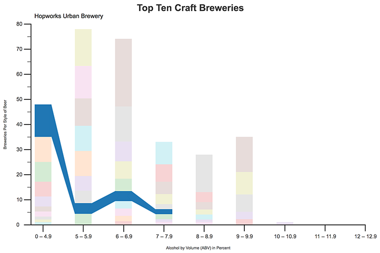
Using the above data visualizations, I developed two prototypes using Axure RP. The first prototype is titled Top Ten Craft Breweries and shows the number of beer styles per brewery and their associated ABV. The user can hover over a bar and track the brewery across the ABV axis.
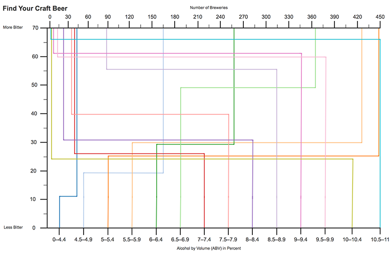
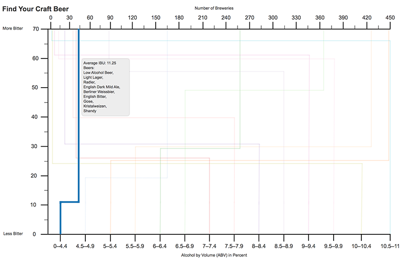
The second prototype is Find Your Craft Beer and shows the number of breweries and how they correspond to an average International Bitterness Unit (IBU) and an average ABV. When a user hovers over a line, the user is shown the average IBU and the style of beers that fall into that ABV set.
Summary
When learning a new concept, you have to fail to learn. Throughout the process of this independent study, I failed many times, which resulted in me having to abandon some visualization designs that I wanted to see through to the end. However, I now know that when visualizing data every decision made has to correlate with the data to avoid making arbitrary decisions that can hinder the user's understanding of the data. The next step is to take the prototypes and develop them with the D3.js library.
Selected Works