Designing For Sterile Human-Machine Interfaces
Overview:
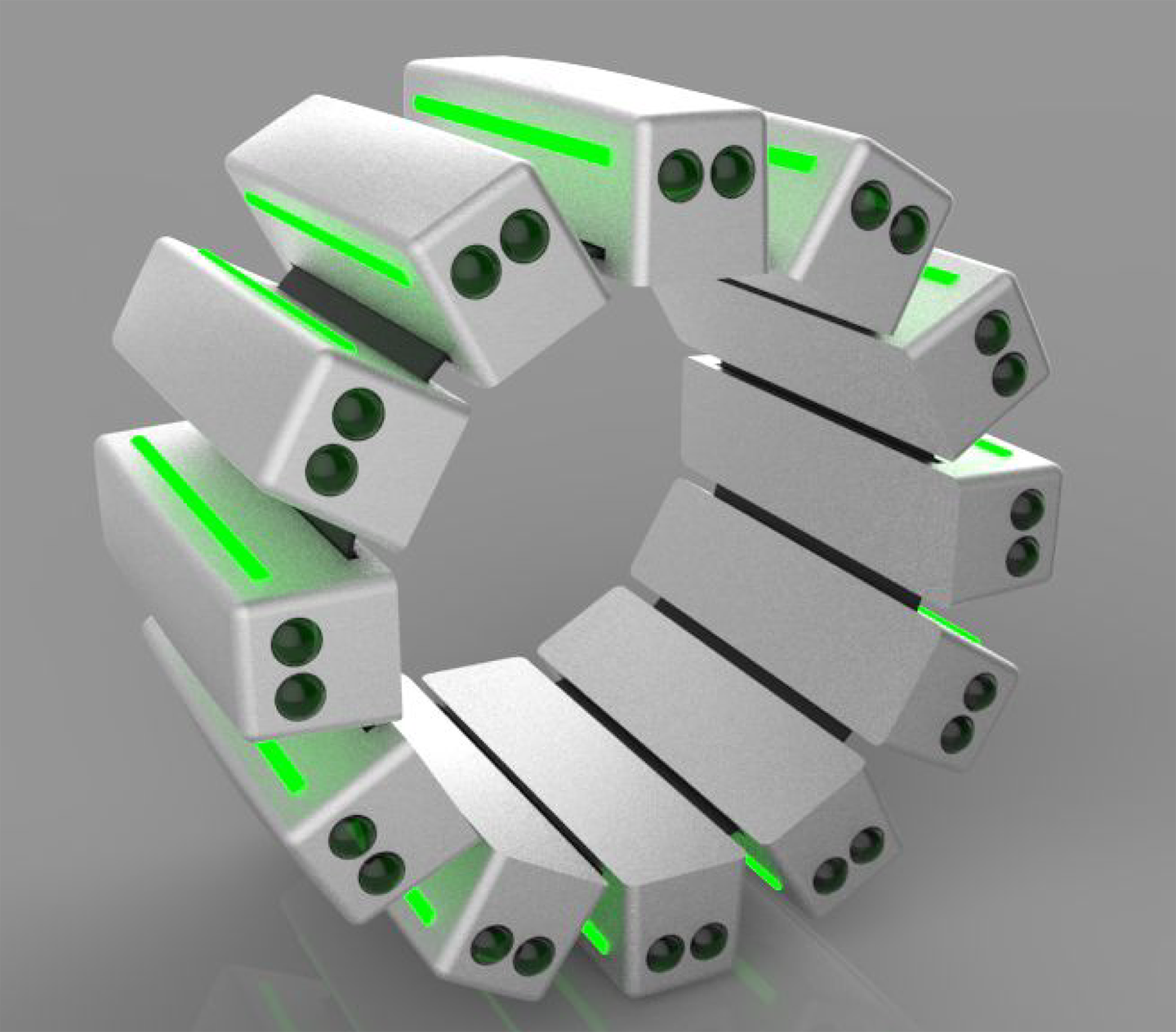
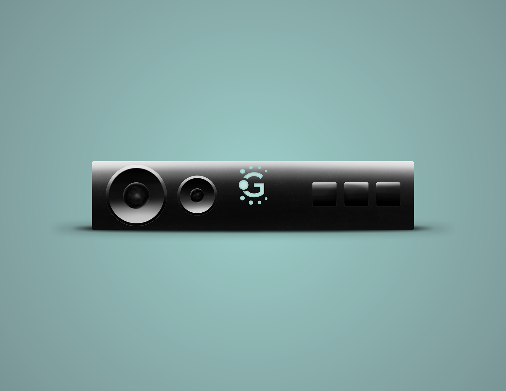
Gesteir allows healthcare professionals to operate an I.V. pump through the use of hand gestures to help in reducing the spread of harmful organisms that can cause a Center Line-Associated Bloodstream Infection.
My Role:
Conduct user research and competitive analysis. Develop empathy maps, personas, experience maps, storyboards, wireframes, user flow, UI mockups, user testing scripts, information architecture, prototype renderings.
Tools:
Photoshop CC, Illustrator CC, InDesign CC, Adobe XD CC, Axure RP Pro
Discovery Phase
According to the Centers for Disease Control and Prevention (CDC) and other health organizations around the world, a center line-associated bloodstream infection (CLABSI) is one of four healthcare-associated infections (HAI). A CLABSI occurs when a patient has a central line that leads to the patient getting a bloodstream infection. Approximately 80,000 CLABSIs occur in ICUs across the United States every year, which adds billions of dollars in costs to the U.S. healthcare system. Out of the four HAIs, CLABSIs are the most preventable.
Competitive Analysis
A competitive analysis was conducted to gain a better understanding of the products that are already using hand gesture technology within the medical field.
- The surgeon does not have to scrub out to look at the images
- It is fast and reliable
- Reduces the surgery time and cost
- Reduces the chance of surgical site infections by eliminating the need to bridge the sterile field
GestSure
Pros:
- It is only used for operating rooms and not for patients' rooms
- It is in full product ready stage but still unknown by healthcare professionals
- It does not directly impact CLABSIs
Cons:
- It allows for sterile interaction with image data
- It responds in real time and without the use of a microphone, head-mounted device, or foot pedals to control the display system
- It reduces the surgery time and cost
Gestix
Pros:
- A calibration process is required before the surgeon can use the system
- After the calibration process, the surgeon must learn and implement eight gestures: Up, up-right, right, down-right, down, down-left, left, up-left
- There is a neutral screen area and to move through images the hand has to be moved to any of the eight positions
- It is still in research phase
Cons:
- It has the potential to be used for hand gesture medical devices of all kind
- It is cheap, at about $100.00 US dollars
Microsoft Kinect
Pros:
- Since it is still mostly being used in a research phase, the exact pros/cons are unknown
- Works only with Windows
Cons:
- Tracks sub-millimeter motion with high accuracy and speed
- Has the potential to create sterile human-machine interactions that feel physical and responsive
- It is hardware agnostic
Google, Project Soli
Pros:
- Still in research/building phase
- Use in healthcare may get overlooked for use in wearables, phones, computers, smart cars, and IoT devices
- Feedback is generated by the sensation of fingers touching each other; if healthcare professionals are wearing gloves the feedback sensation may be decreased
Cons:
- Uses hand and eye gestures
- The surgeon does not have to scrub out to look at the images
- By using the Kinect, the surgeon does not have to wear any sensors that would allow him/her to move the images
Nichii Gakkan, OPECT
Pros:
- It is only used for operating rooms and not for patients' rooms
- Used in Tokyo only
- Does not directly impact CLABSIs
- Expensive - 498,000 yen (around $6,350)
Cons:
Ethnographic Research
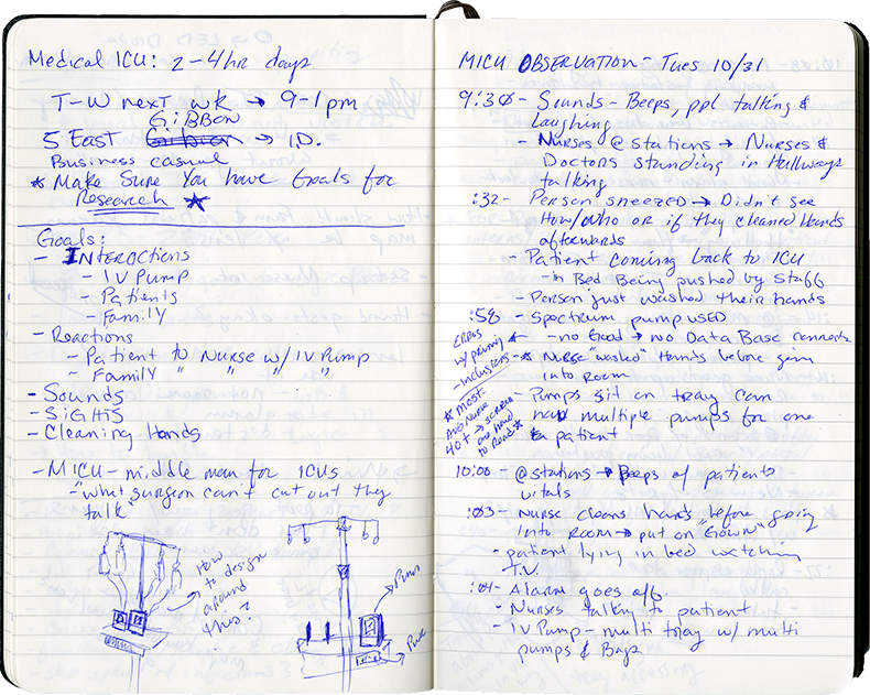
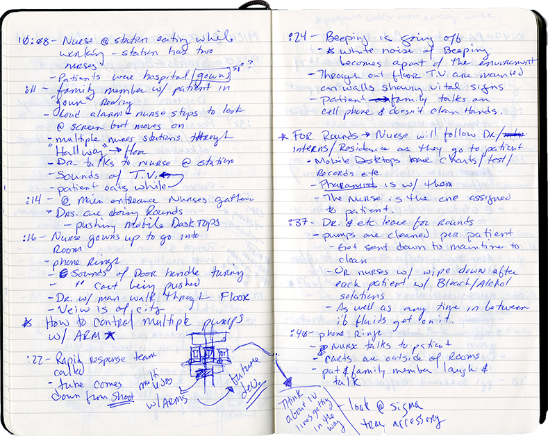
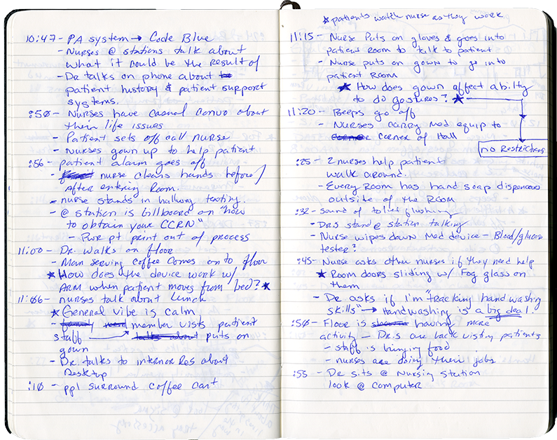
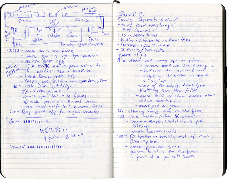
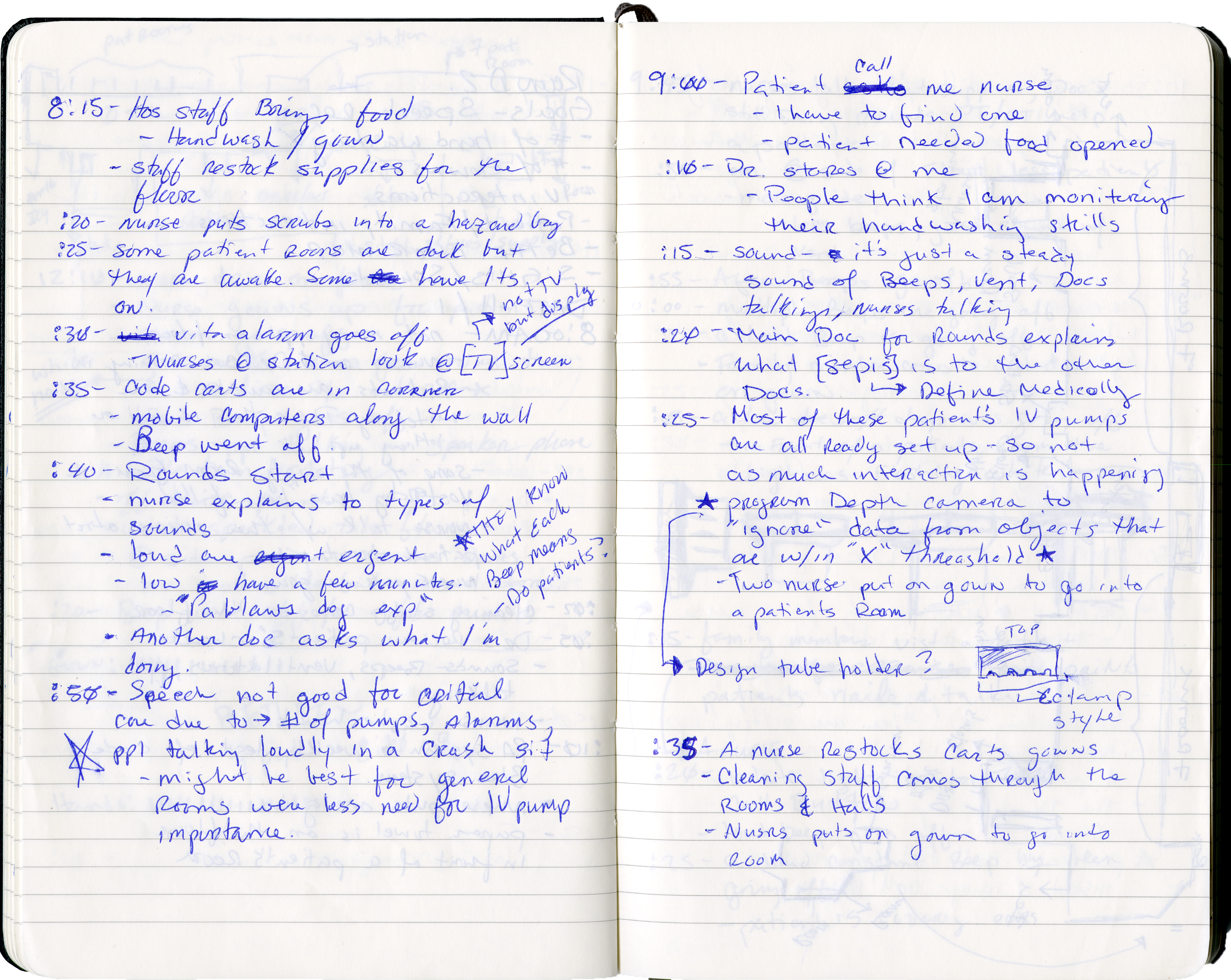
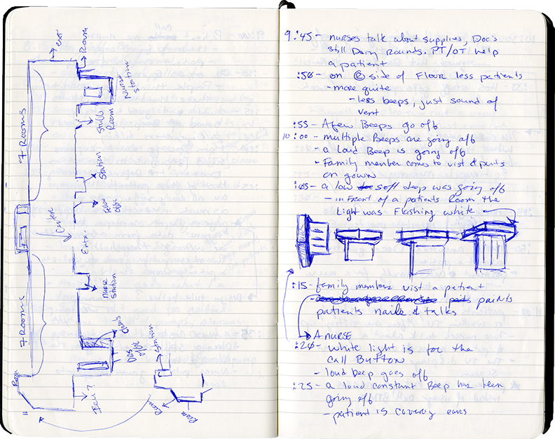
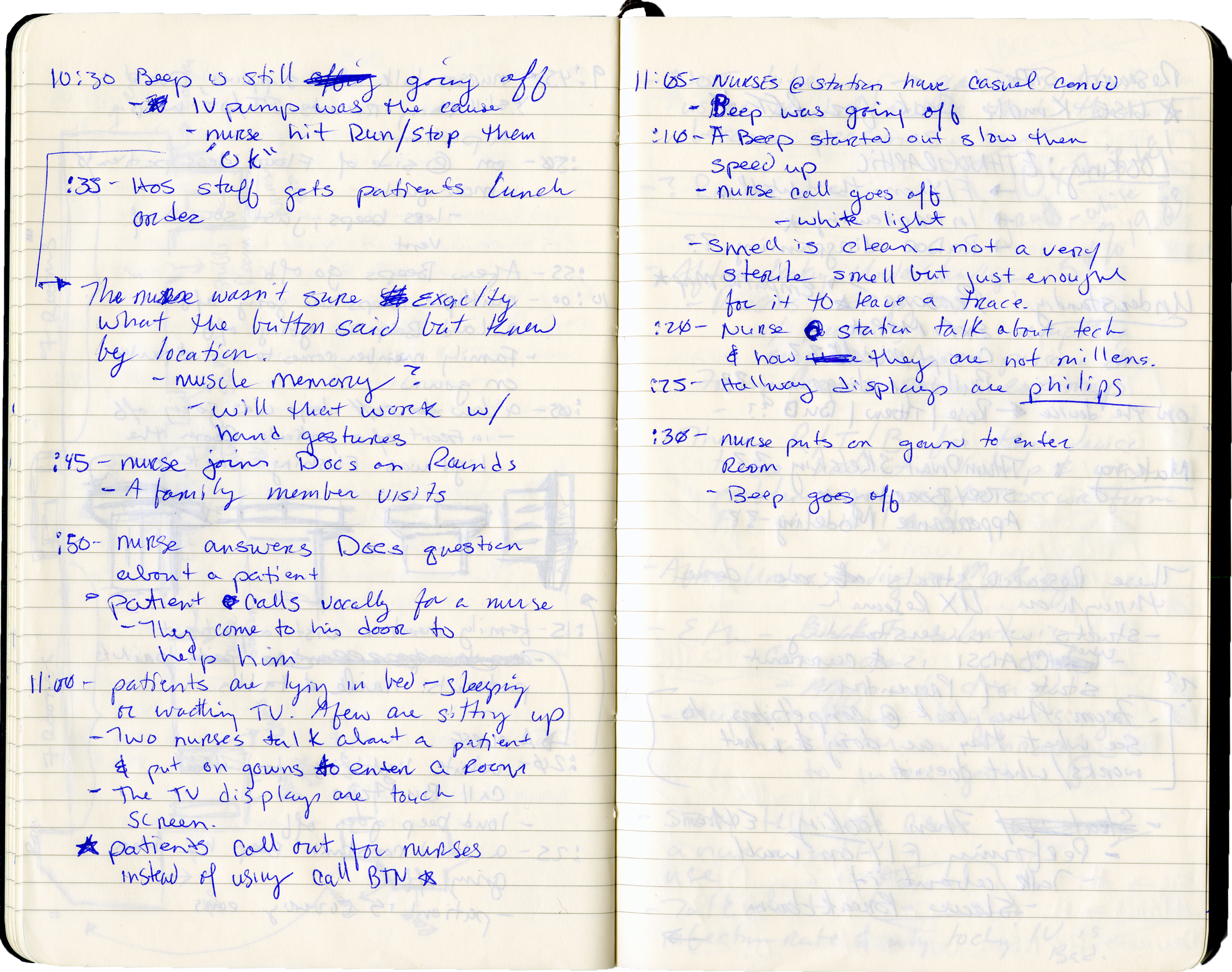
Ethnographic research was performed in a medical ICU at Thomas Jefferson Hospital. This observation was done over two four hour days to gain insight into a healthcare professional's everyday environment.
Personas & Experience Map
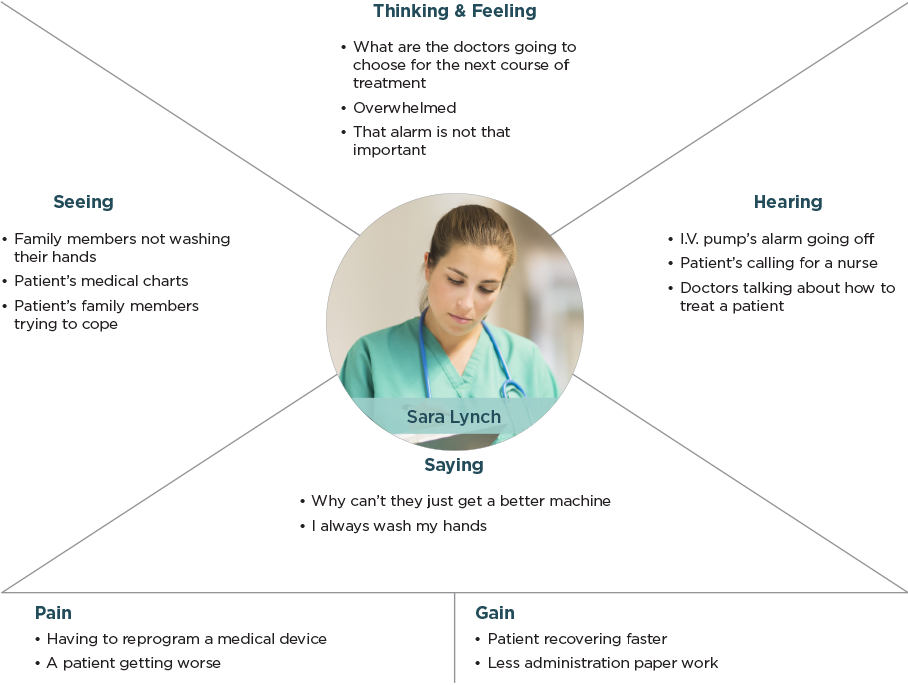
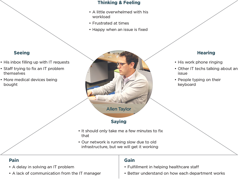
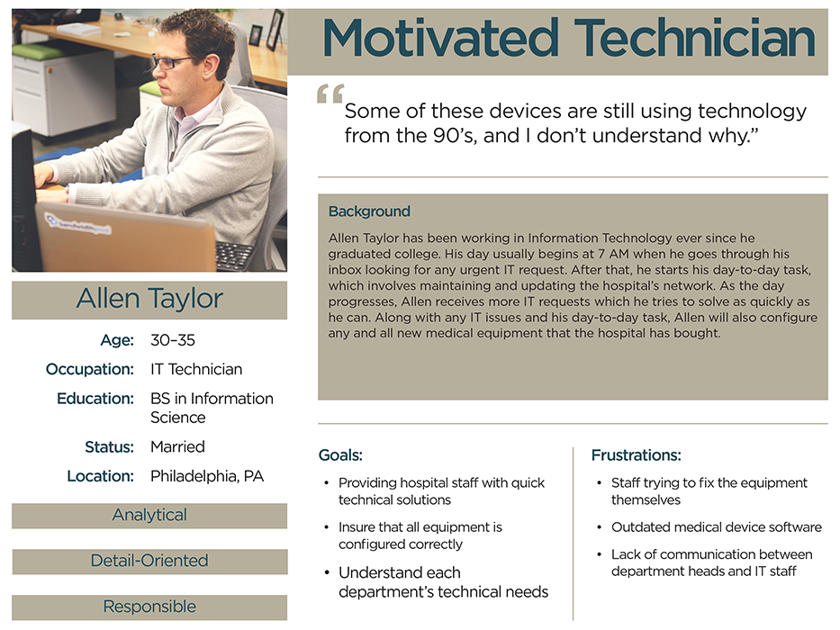
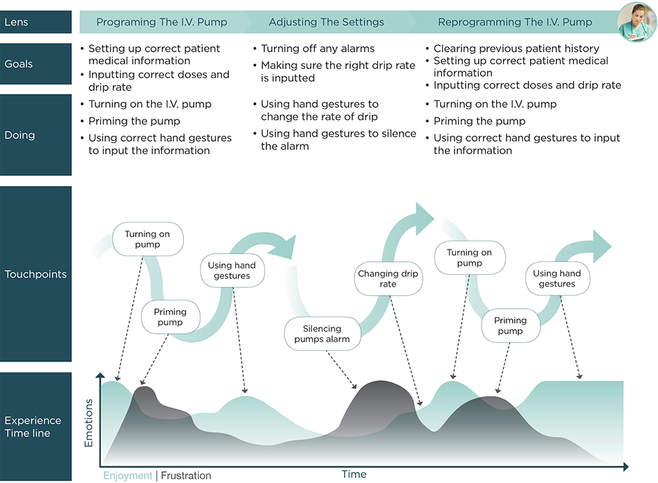
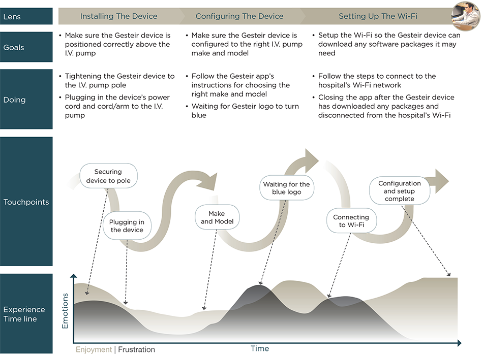
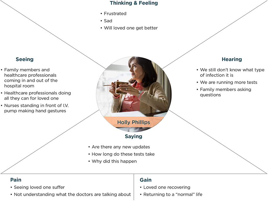
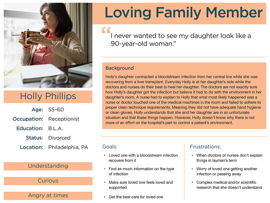
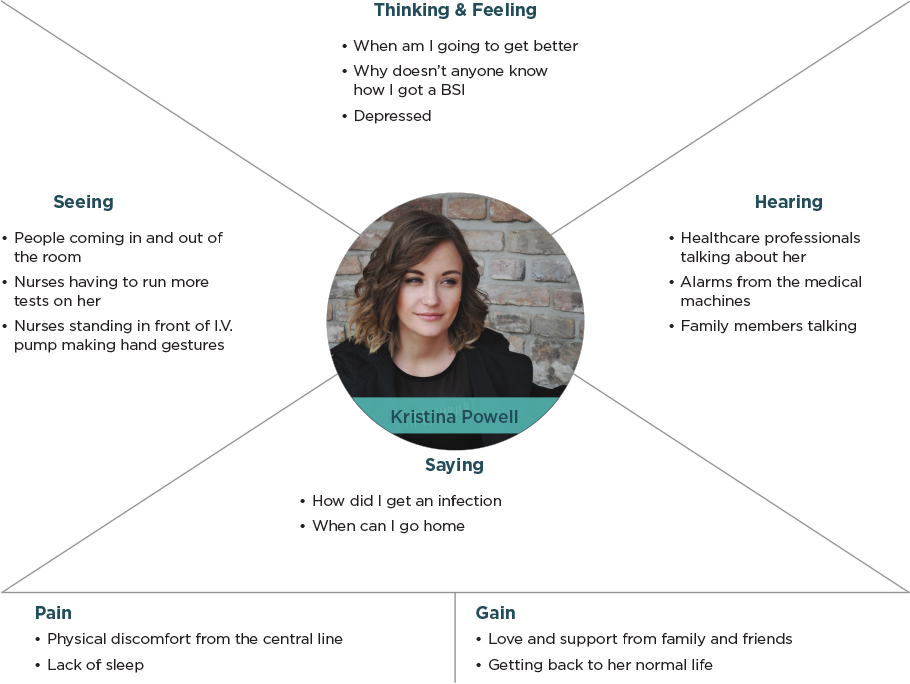
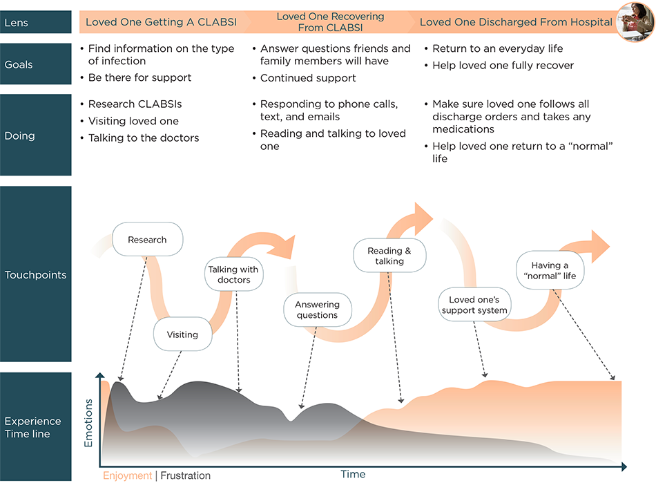
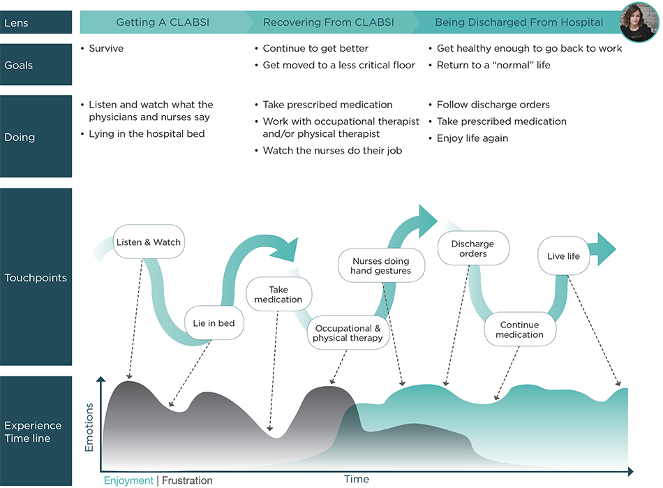
The next aspect of the ethnographic research was conducting interviews. The data from these interviews were used to develop the personas and experience maps. There are four users: two direct users and two indirect users. The direct users are nurses and IT professionals, while patients and family members are the indirect users. To aid in the development of the personas empathy maps were created to allow for a greater insight into each user’s mental model.
Direct Users

Indirect Users

Storyboards
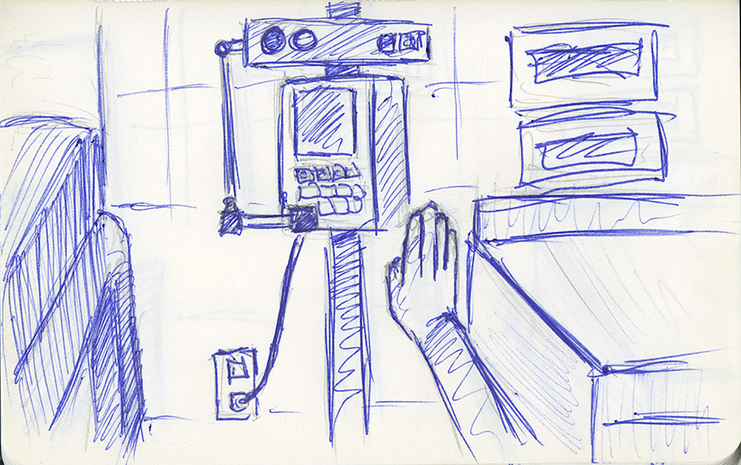
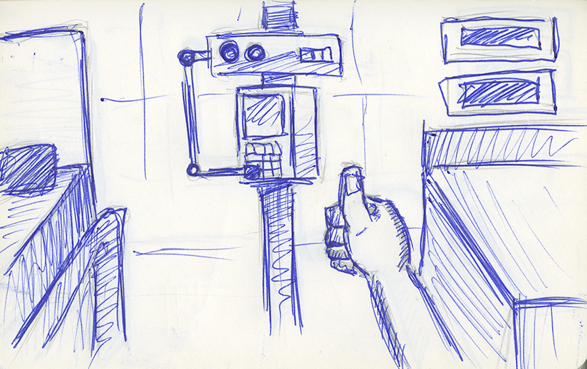
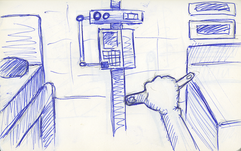
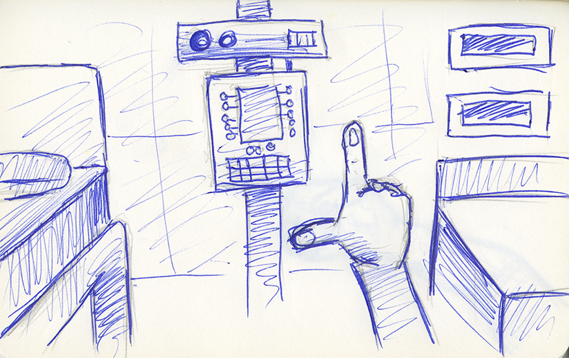
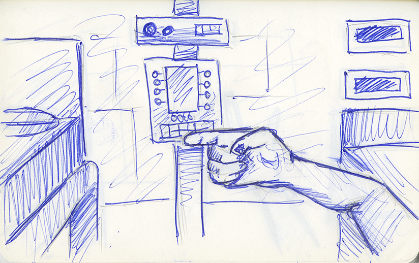
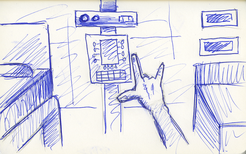
The hand gestures used to control the I.V. pump are the critical component to creating an experience that will not hinder healthcare professionals from completing their tasks, thus creating an enjoyable experience. Much like the design of the I.V. pumps, the hand gestures need to encompass a function over form design mentality.
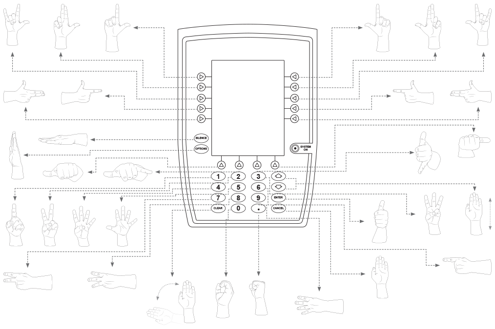
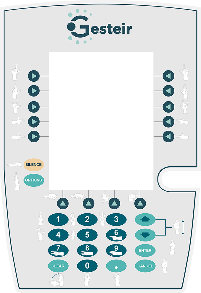
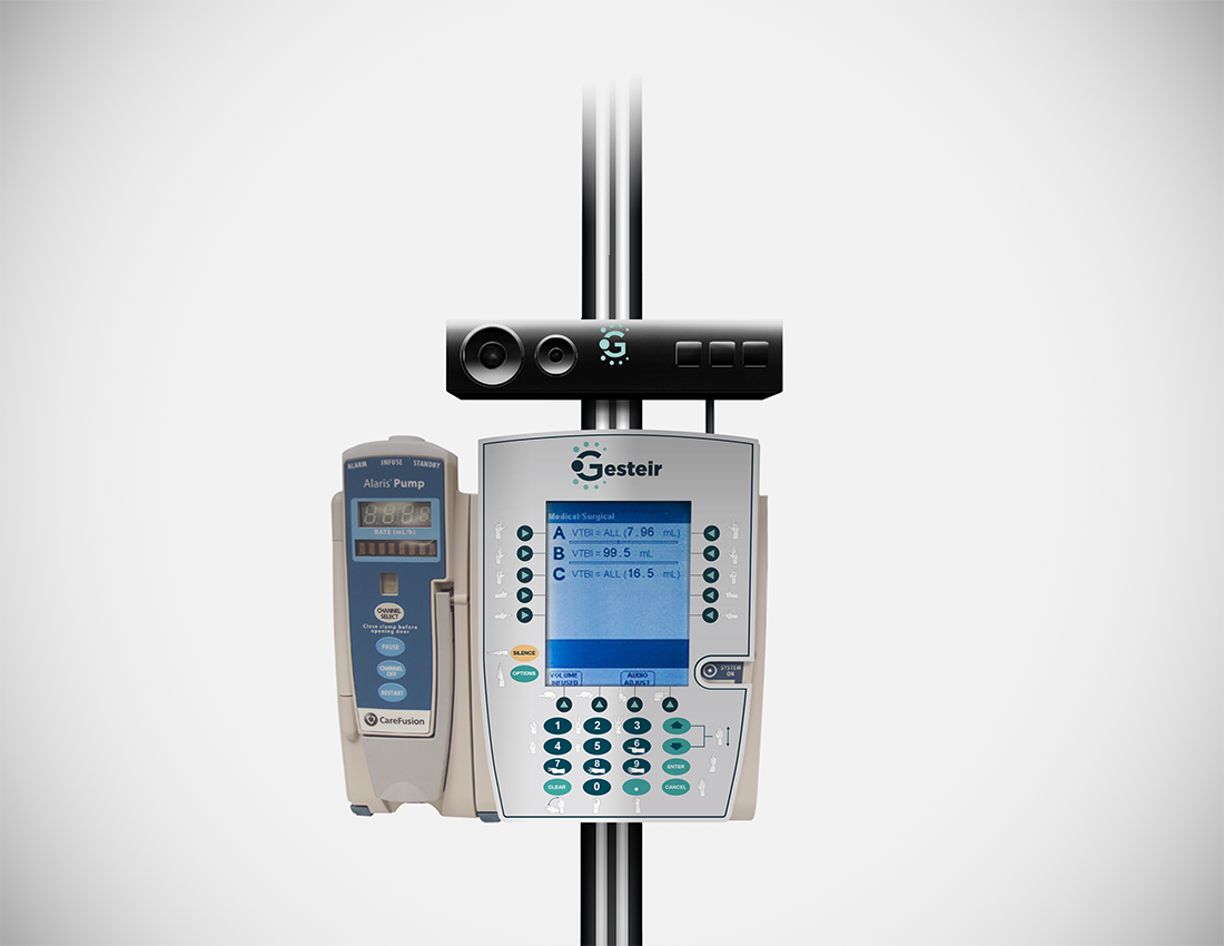
The concept of natural mapping plays an essential role in which hand gestures control which buttons. By using principles from Gestalt psychology and grouping buttons that are either close to each other or that have a similar function will aid in creating a natural map for the healthcare professional. The gestures for buttons that are in proximity to each other have slight variations to reinforce the concept of natural mapping. For example, the buttons on the left side of the screen for an Alaris™ PC pump are controlled with the user’s left hand, while the buttons on the right are the same gestures as the left, but done with the user’s right hand.
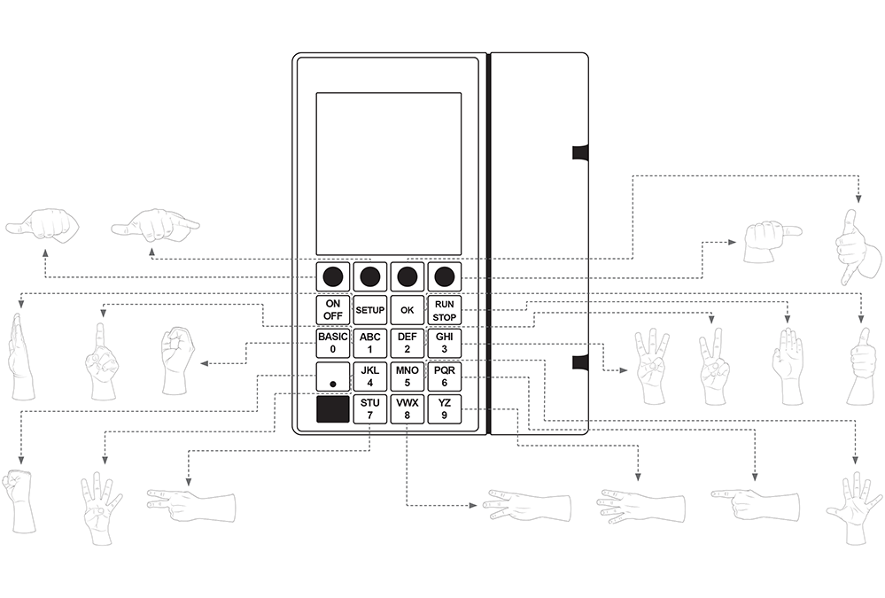
To input numbers, the user will use the “everyday” hand gestures for one through five. For numbers six through nine the user’s forearm is horizontal with their finger(s) extended to designate the number added to five.
Sigma Spectrum I.V. Pump
Alaris™ PC Pump
Sigma Spectrum I.V. Pump Hand Gestures
Alaris™ PC Pump Hand Gestures
User Flow
Gesteir Configuration App User Flow

I.V. Pump User Flow

Information Architecture
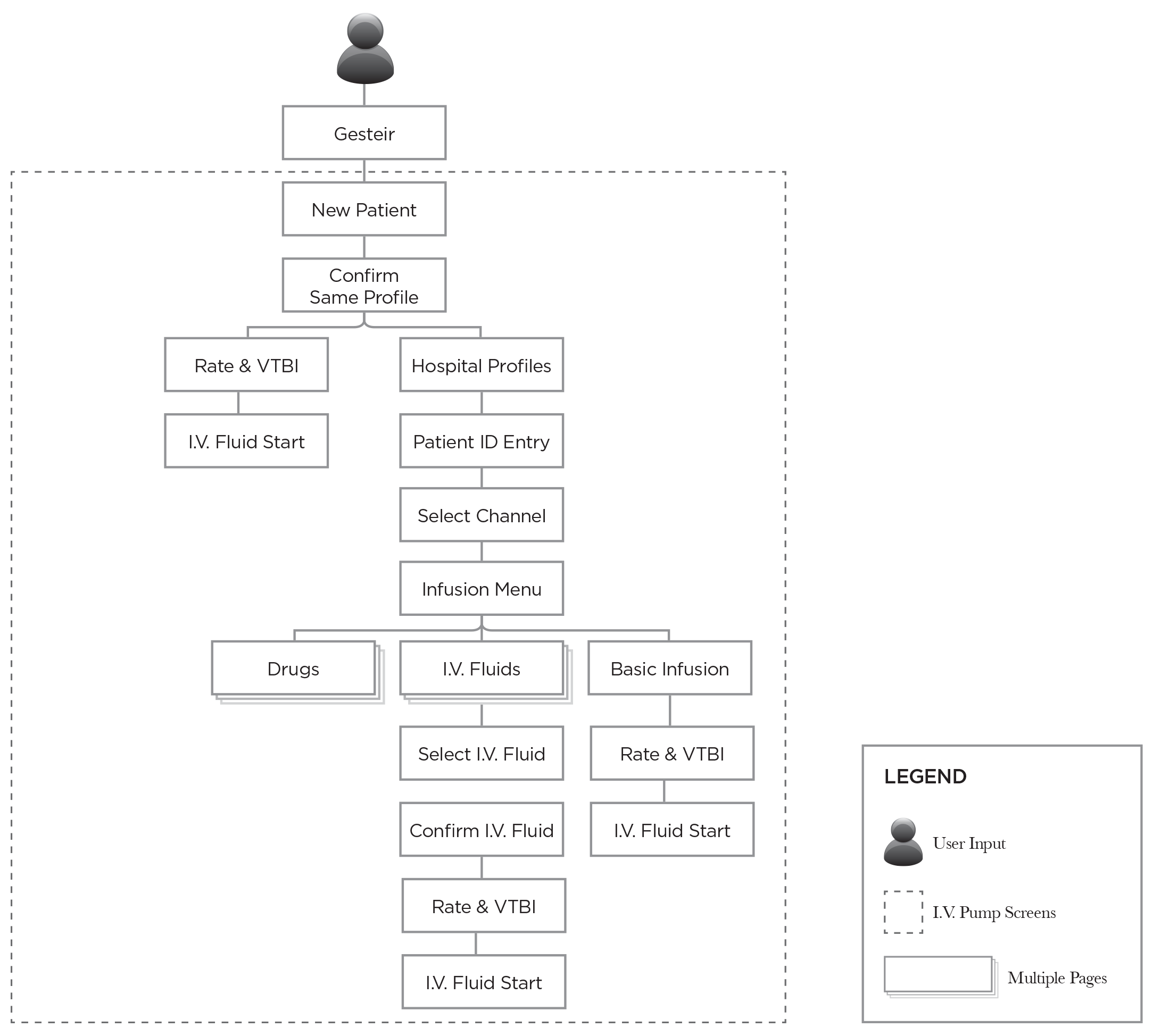
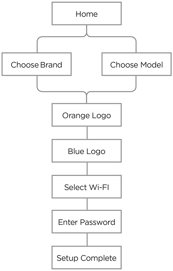
The IA for the I.V. pump and the configuration app are narrow and deep because both require that the user complete one task at a time before proceeding to the next screen and completing the next task. This type of hierarchical design ensures that Gesteir will be configured properly and that the I.V. pump will dispense the proper amount of fluid required for the patient. It should be noted that I did not design the IA for the I.V. pump but mapped it as a requirement for the project.
I.V. Pump
Gesteir Configuration App
Wireframes & Visual Design
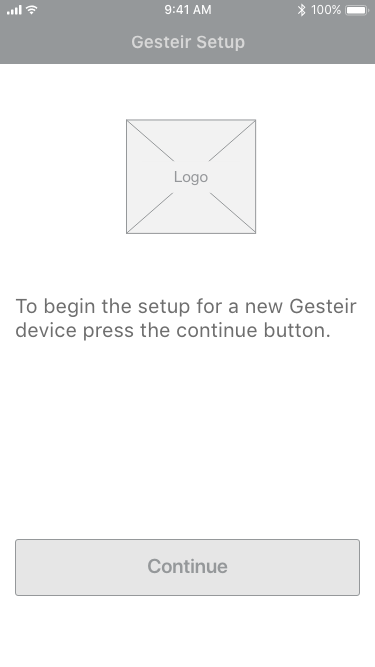
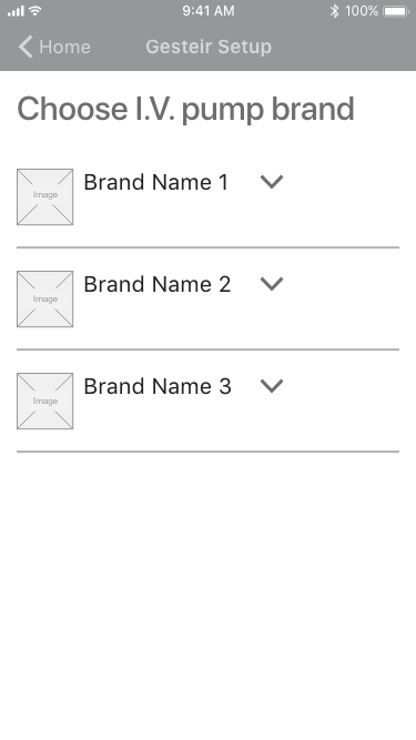
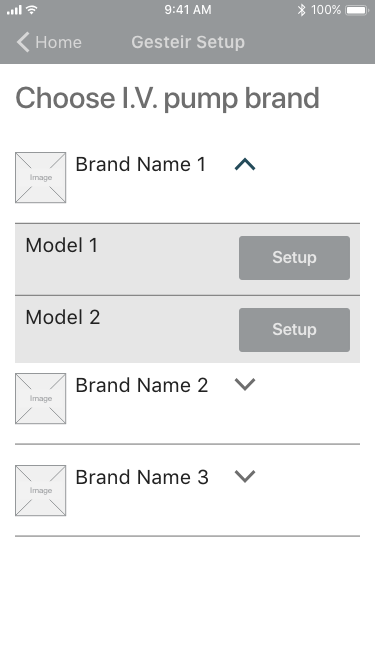
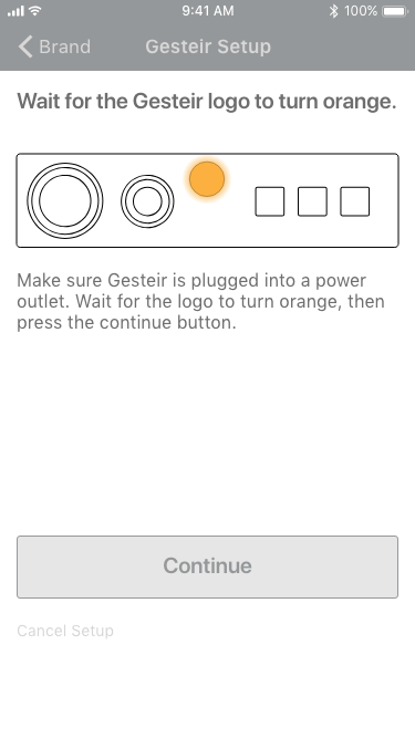
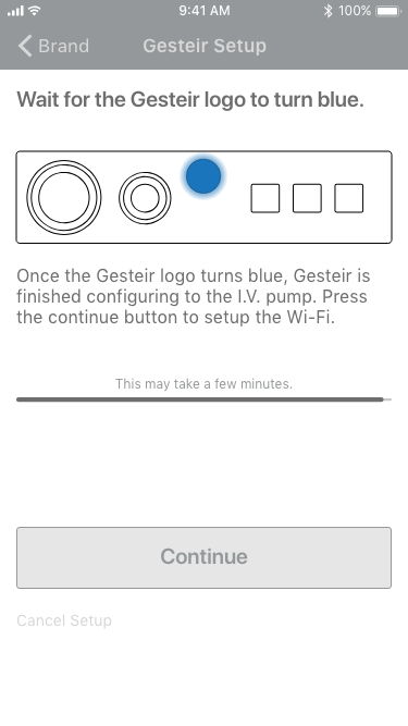
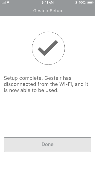
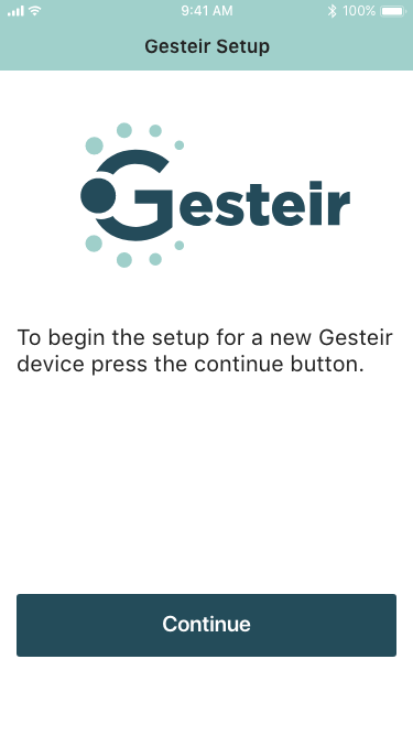
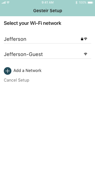
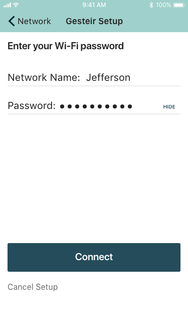
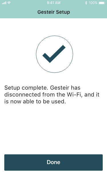
The wireframes are for the Gesteir configuration app that would mainly be used by the hospital's IT staff when setting up Gesteir for the first time and configuring it to the I.V. pump.


UI Designs
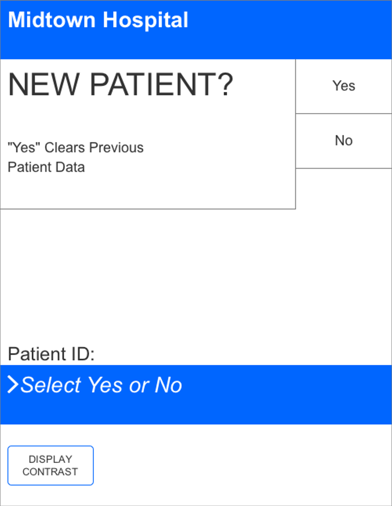
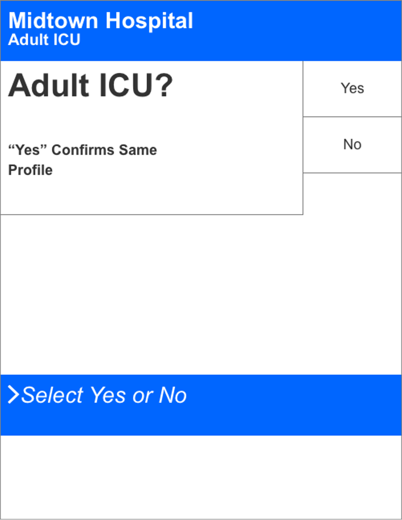
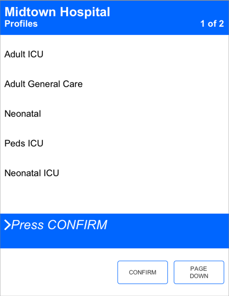
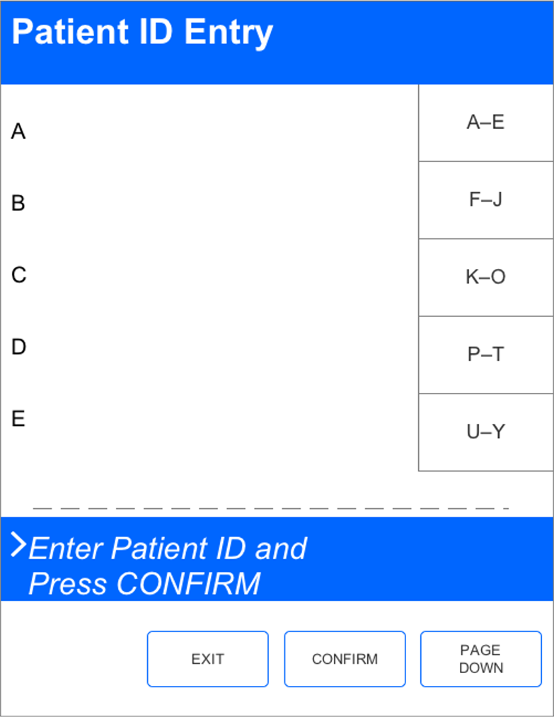
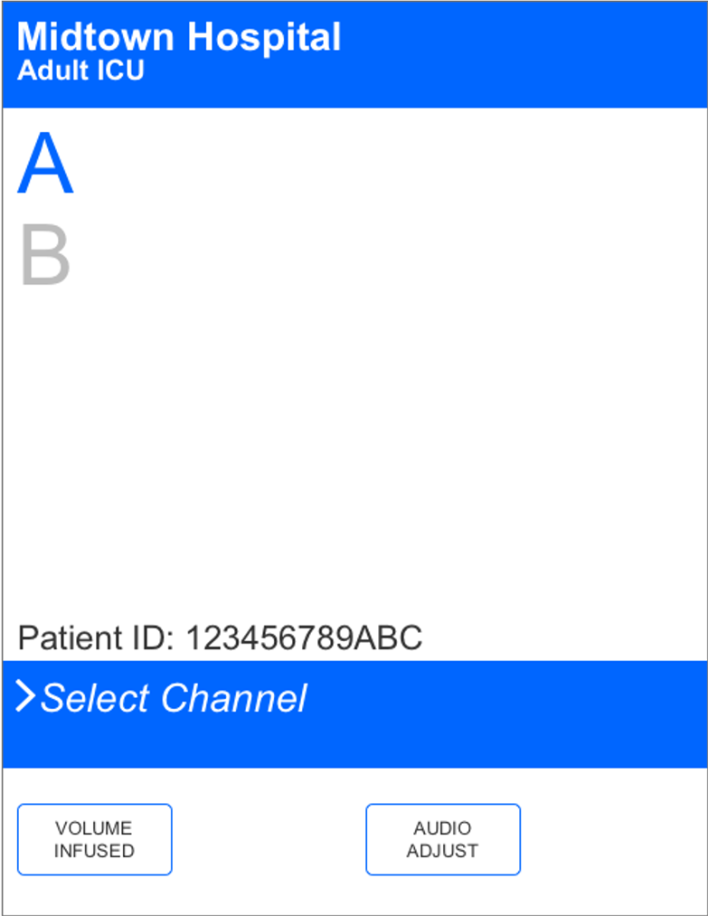
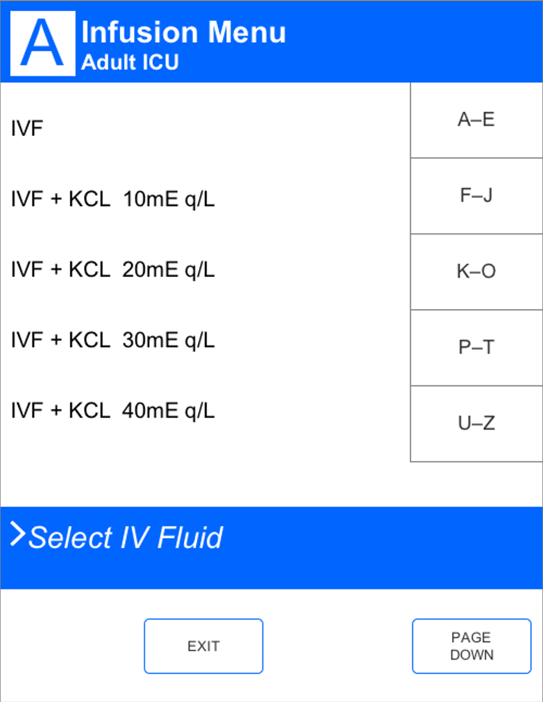
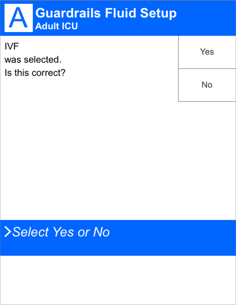
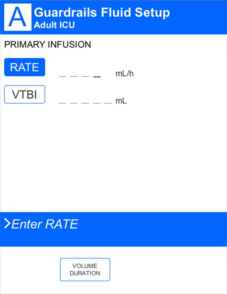
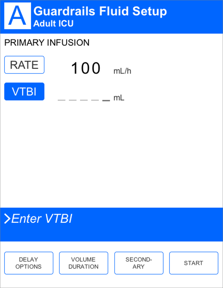
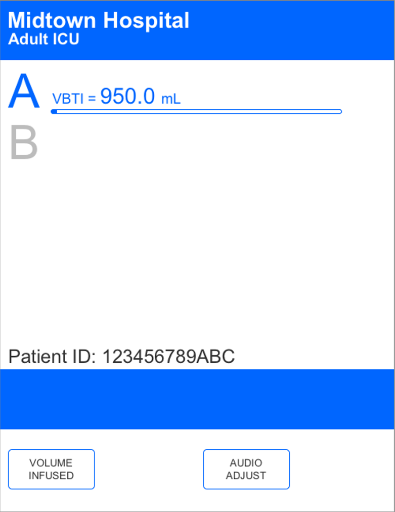
The UI mockups for the I.V. pump are visual representations of an Alaris ™ PC I.V. pump. The design and layout of the mockups are how the actual screens appear. The flow follows the path a user takes when programming the pump for a new patient who does not have a saved profile.
New Patient
Confirm Same Profile
Hospital Profiles
Patient ID Entry
Select Channel
Infusion Menu
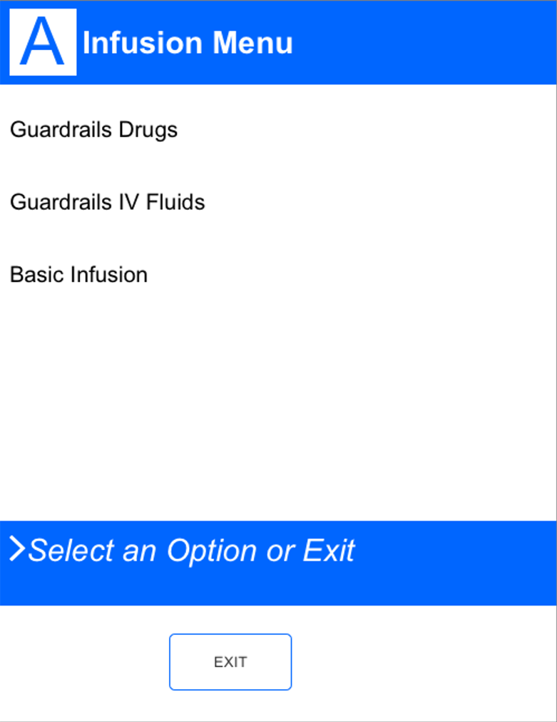
Select I.V. Fluid
Confirm I.V. Fluid
Select Rate
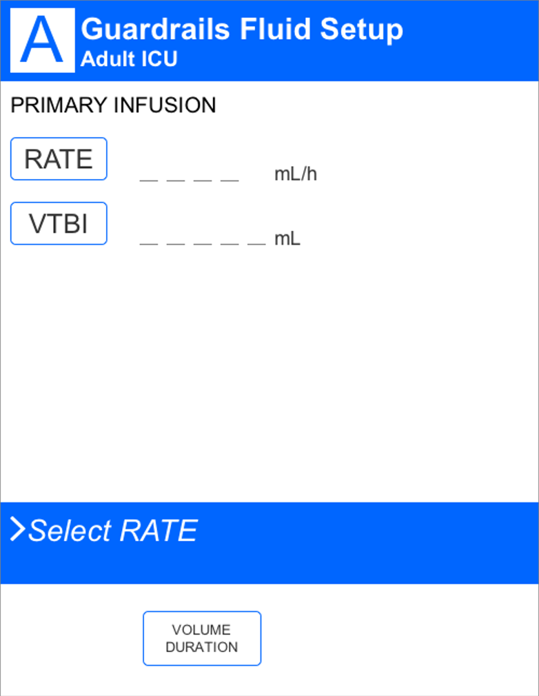
Enter Rate
Enter VTBI
Start Infusion
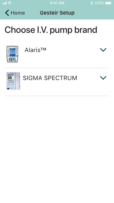
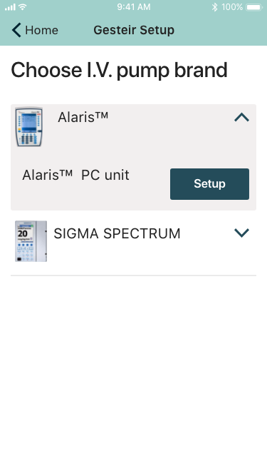
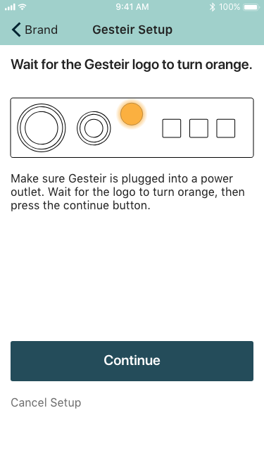
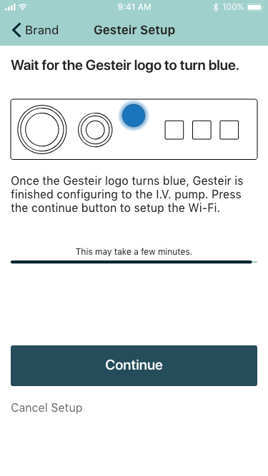
Gesteir Configuration App Design
Prototype Renderings
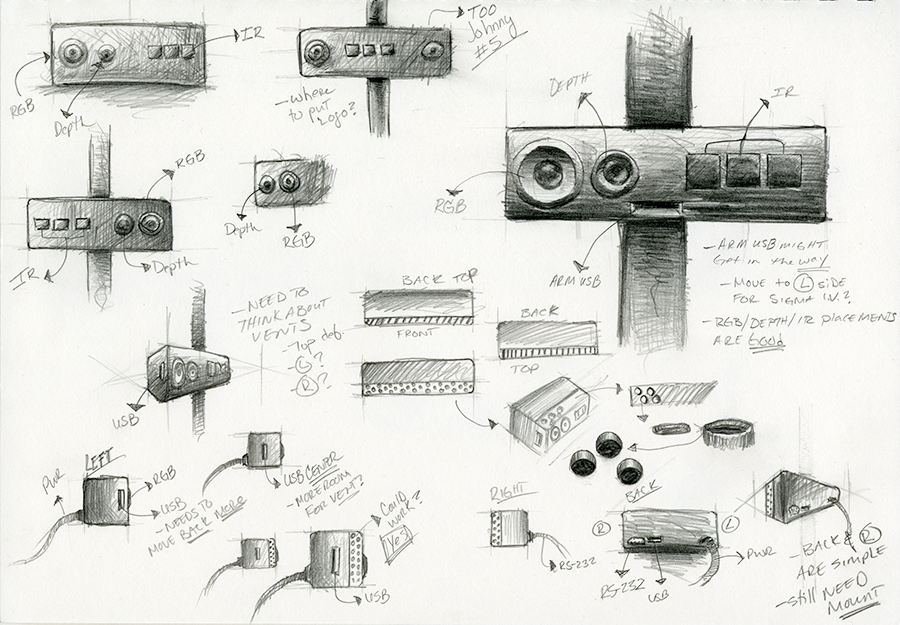
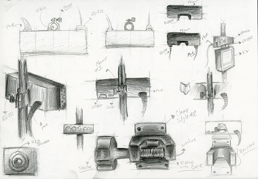
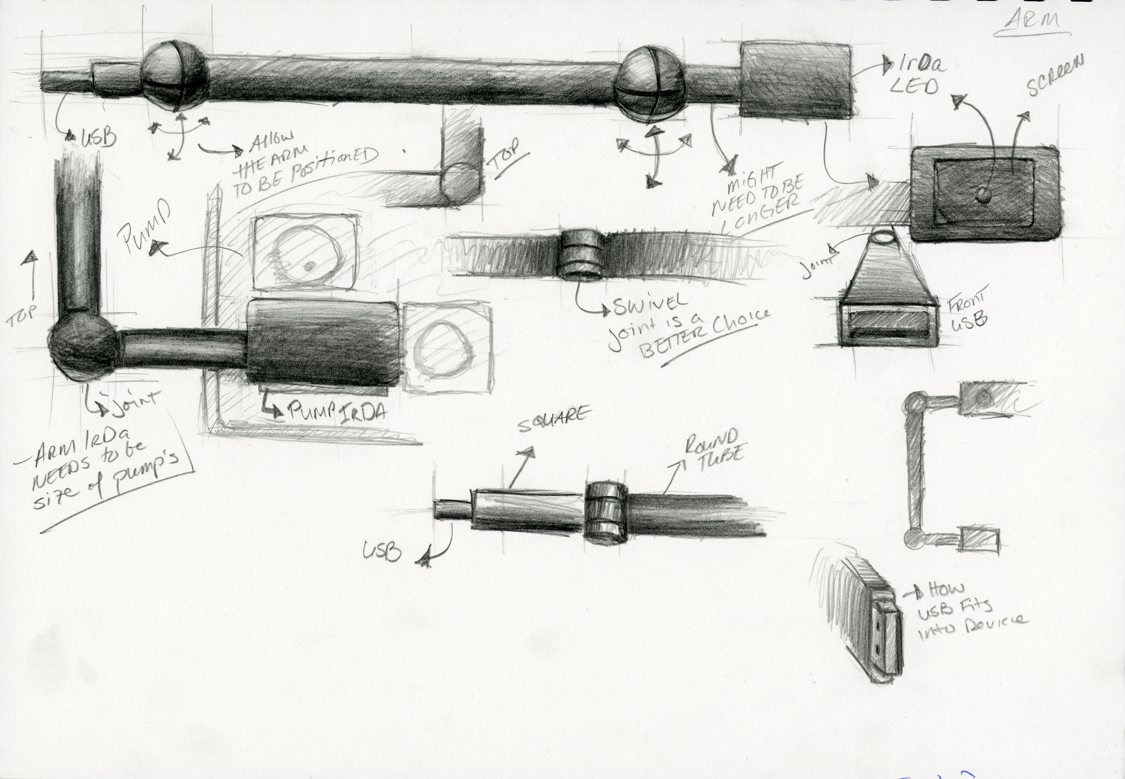
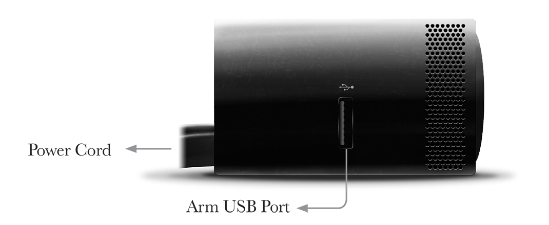
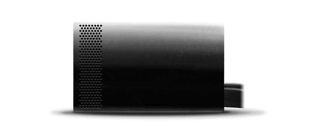
With all of our research, we were able to start designing the device. We began with very loose sketches then moved onto refined pencil renderings. Finally, ending with renderings done in Photoshop.

Error Signal

Orange Light for Configuration App

Blue Light for Configuration App

Back View

Back View With Pole Clamp

Left View
Right View
Gesteir Accessories
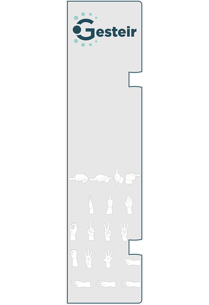
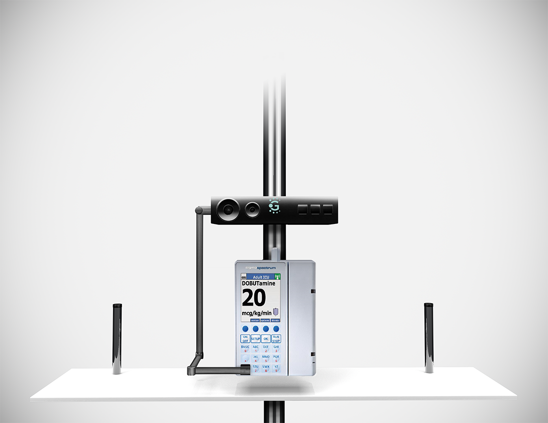
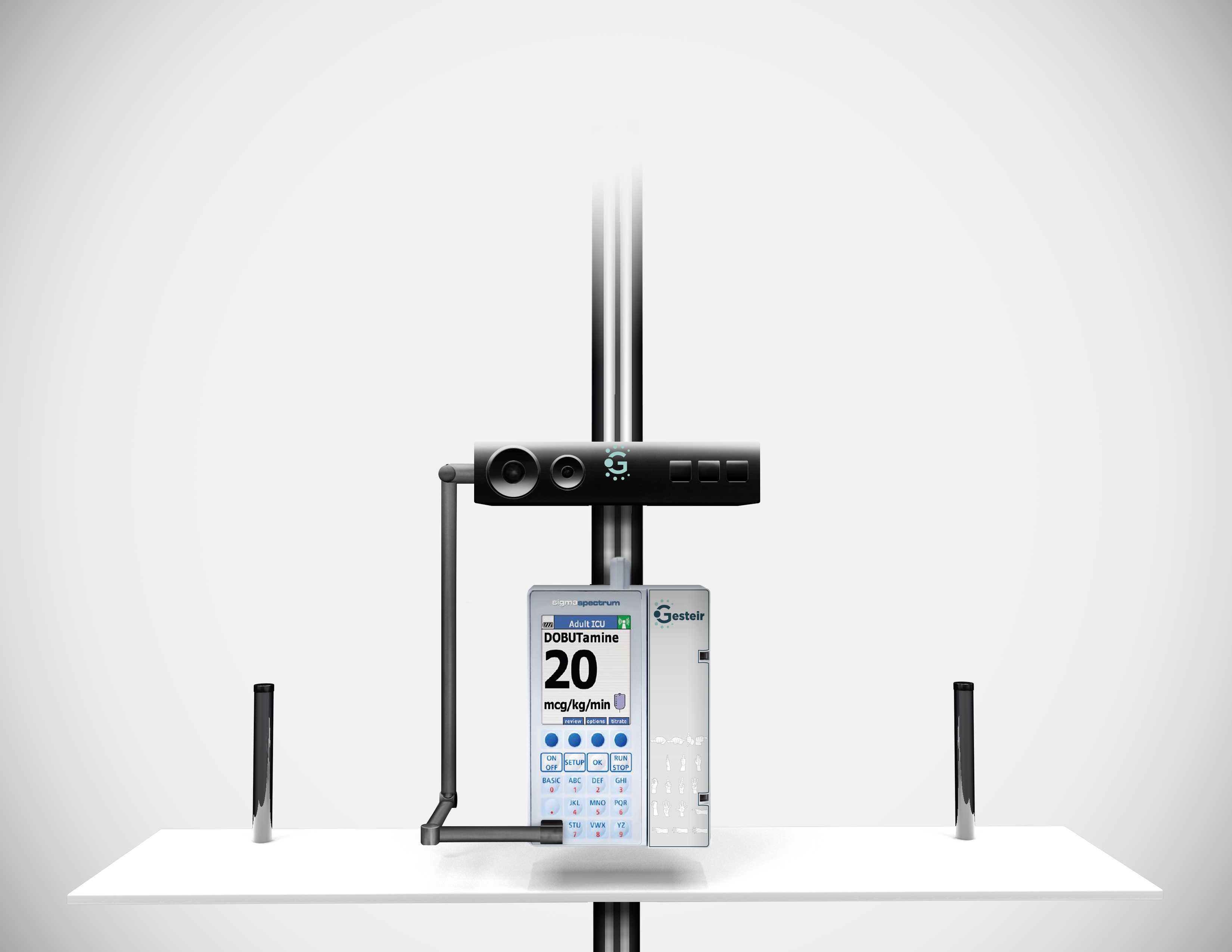
The arm accessory allows Gesteir to communicate with I.V. pumps that have an infrared interface that uses Infrared Data Association (IrDA) protocol. IrDA provides wireless line-of-sight connectivity between Gesteir and the I.V. pump. Decal accessories are also available for the Alaris™ PC I.V. Pump and Sigma Spectrum I.V. Pump. These decals help healthcare professionals in recalling which hand gesture goes with which button.
Gesteir Arm Accessory: Top View

Gesteir Arm Accessory: Front View

Gesteir Arm Accessory: Back View

Alaris™ PC I.V. Pump Decal
Sigma Spectrum I.V. Pump Decal
Gesteir In Use Without Decals
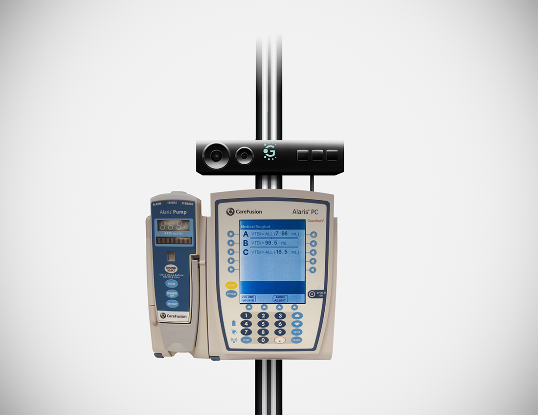
Gesteir In Use With Decals
Testing
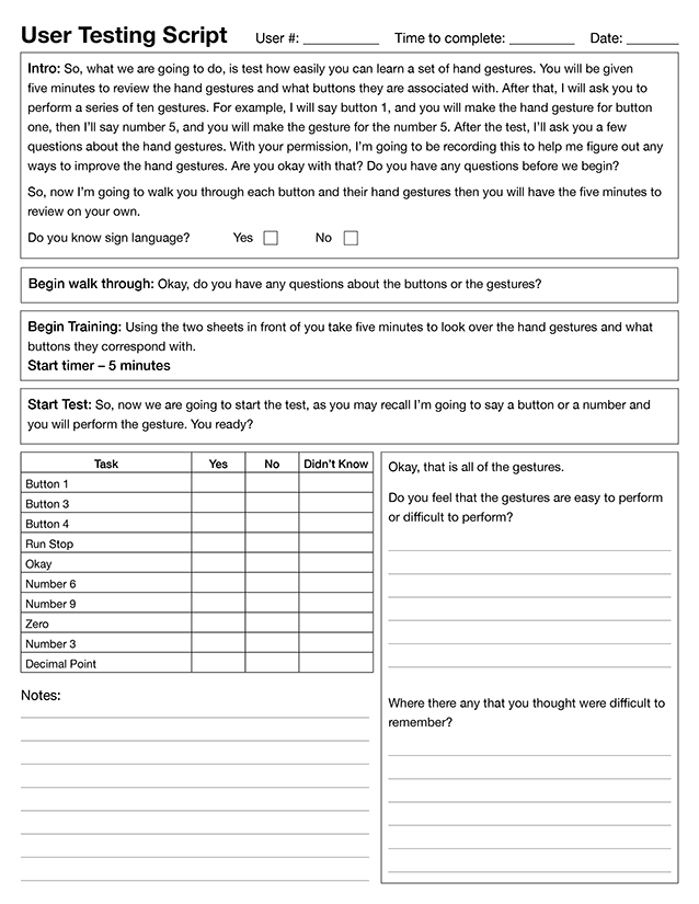
The user testing was conducted to determine the efficiency of the hand gestures. The test was divided into three parts. One, the introduction and explanation of the test. Two, user training, where the users studied the hand gestures and their associated buttons for five minutes. The final stage was the actual test, where the users were asked to perform the hand gestures for ten different buttons while being assessed on their ability to perform the gestures correctly, followed by a few questions. The following form and script were used for each user.
Findings
A total of five users were tested and were people who were completely unaware of what these gestures were. The users were tested on the Sigma Spectrum I.V. pump and had two handouts. One was a picture of the I.V. pump and the second was the hand gestures and their corresponding buttons and numbers.
- Time to complete: 40 seconds
- Number Correct: 7
- Number Incorrect: 3
- Key Findings: The user knows sign language which made learning the hand gestures more manageable. However, because the user knows sign language, three of the tasks were the right gestures but done as if the user was signing to a person and not standing in front of a machine, making them incorrect gestures. As a result of this, the tests that follow have an added question of, “Do you know sign language?” as well as more precise instructions on the importance of wrist position when performing the hand gestures. The user has arthritis which made the decimal point gesture a little complicated, but the user was able to do it correctly.
User One
- Time to complete: 45 seconds
- Number Correct: 7
- Number Incorrect: 3
- Key Findings: The user performed button one, three, and four incorrect because the user misinterpreted buttons as numbers. However, the user realized this mistake and made the right gestures for the corresponding buttons. This error is not a result of the inefficiency of the hand gestures but an oversight on my part in conducting the test. The tests that proceed had clear instructions as to what gestures correspond to what buttons and that there is a difference between “button one” and “number one” etc. The user felt that the hand gestures were easy to perform and remember other than differentiating between “button” and “number.”
User Two
- Time to complete: 45 seconds
- Number Correct: 9
- Number Incorrect: 1
- Key Findings: By the time of this user testing, all of the mistakes of the test on my part had been worked out, and the user understood correct wrist position and the difference between “button” and “number.” Therefore, the user only got one hand gesture wrong: the user performed Setup instead of Run Stop. The user had no issues performing the gestures and felt that given more time to learn the hand gestures the user would have done it correctly.
User Three
- Time to complete: 42 seconds
- Number Correct: 9
- Number Incorrect: 1
- Key Findings: The user felt that the hand gestures were natural to do and were very straightforward. The user also thought that they were not difficult to remember, but when asked to do out of order it took the user a few seconds to recall the proper gesture. The user held up the correct number of fingers for “number 3” but did it in the way that was correct for the user’s culture. Even though the right amount of fingers were held up, the gesture was incorrect. Performing numbers this way is a cultural difference that will have to be addressed in the standardizing of the users learning the hand gestures.
User Four
- Time to complete: 54 seconds
- Number Correct: 10
- Number Incorrect: 0
- Key Findings: The user thought that “button 2” was a little odd to perform due to having to stick out the user’s pinky. This user was the only user who felt this way. In the future, when more testing gets completed, there can be an analysis of the data to see if this hand gesture is an issue. However, as of right now, this gesture appears to have no impact on the majority of the users tested. The user is left-handed which made learning the gestures a little harder because the illustrations show a right hand. The user was still able to make the hand gestures correctly but look longer to map a right hand to a left hand. The user also felt given more time the user would be able to recall buttons one, three, and four a lot quicker since these were new hand gestures to the user.
User Five
Summary
From the user testing, it shows that the hand gestures are easy to learn. By taking the scores from each user: user one, 70%, user two, 70%, user three, 90%, user four 90%, and user five, 100% and calculating the average, we get an average score of 84%. It is fair to say that this score could have been higher if there had been no oversights in the testing parameters, such as proper wrist position and a clear difference between the buttons labeled one through four and numbers one through four.

