Research & Design Methods
Researching and designing a prototype for a toy
Overview:
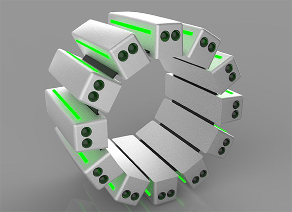
Working with another UX designer, Karthik Srikrishna Swami and an industrial designer, Nikhil Gala, we had to conceptualize a toy for children between the ages of 4 – 8. The only requirement was the toy had to have a screen in one way or another. Our solution was a training aid that allowed children to learn the fundamentals of how to swing a baseball bat. Parents and coaches could monitor the child's progress through the app that accompanied the training aid.
My Role:
Aid in user research and wireframing.
Tools:
Various research methods and Axure RP Pro
Discovery Phase
Since the project solely revolved around research and design techniques, the discovery phase was the primary focus. To start off, we began with ethnographic research by interviewing a local high school baseball coach and observing the team's practice to understand how the coaches instruct the players in hitting techniques.
- The coach was interested in the idea that we presented to him
- He said it would save him lot of time if all the data were stored in an app
- He was more interested in the kind of data that would help his players improve their skills
- The coach thinks use of technology is a great way to instruct kids
- The coach thinks the idea of using technology to train kids is experimental
Interviewing:
- The kids were trying their best to hit the baseball
- They were also trying to hit it the baseball in the "sweet spot" of the bat
- The coach was explaining the necessary techniques to the kids
- He was only concentrating on the kids making contact with the bat
Fly-on-the-wall observation:
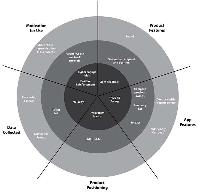
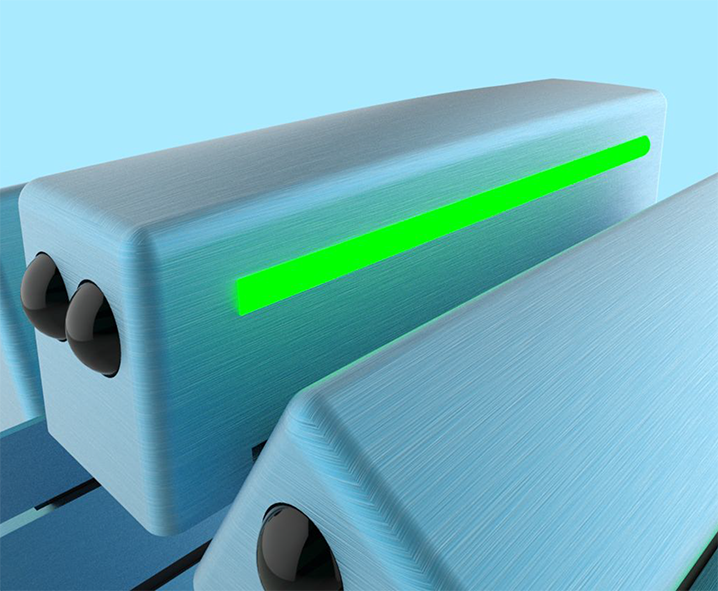
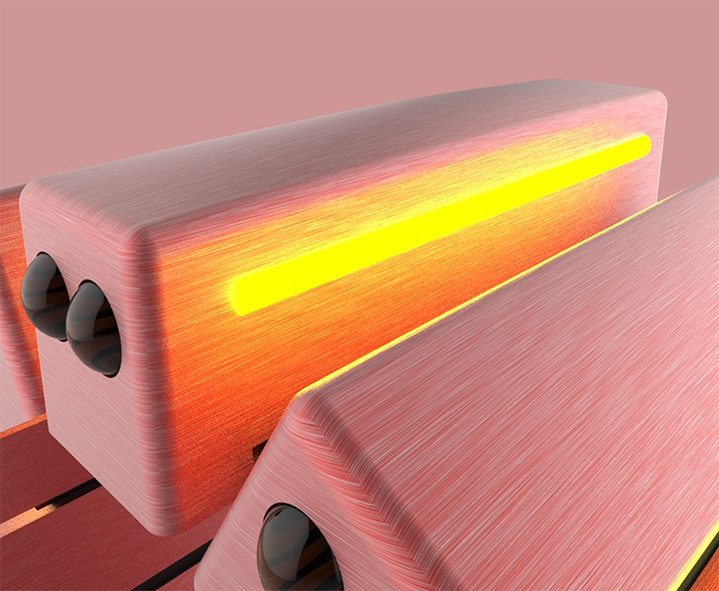
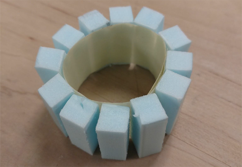
From there we gathered participatory research by creating a Radar Diagram for the app and the training aid which we decided would best be suited as a sensor that fits over the bat just above the child's hands. We also had users build the app by using sticky notes to gain insight on what features they wanted, and how they wanted the app laid out.
Radar Diagram
Build Your Own
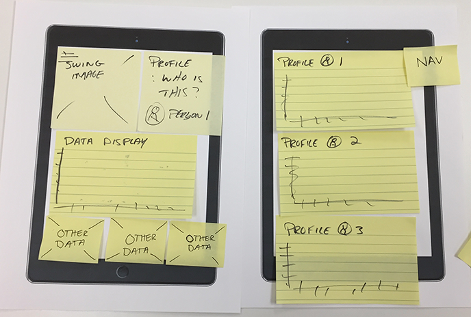
The next stage was using the Think Aloud and Critique methods. These were done with very early prototypes of the sensor and app and aided in evaluating the user's experience with both items.
- Users understand the information displayed on the training page
- Users understand the flow of the app
- Users understand the profile page but are unclear on how to add new users
Think Aloud:
App
- Users like the lights feedback on the sensor
- Users also like the way the sensor can be moved to different positions on the bat, so it does not touch the hands
Sensor
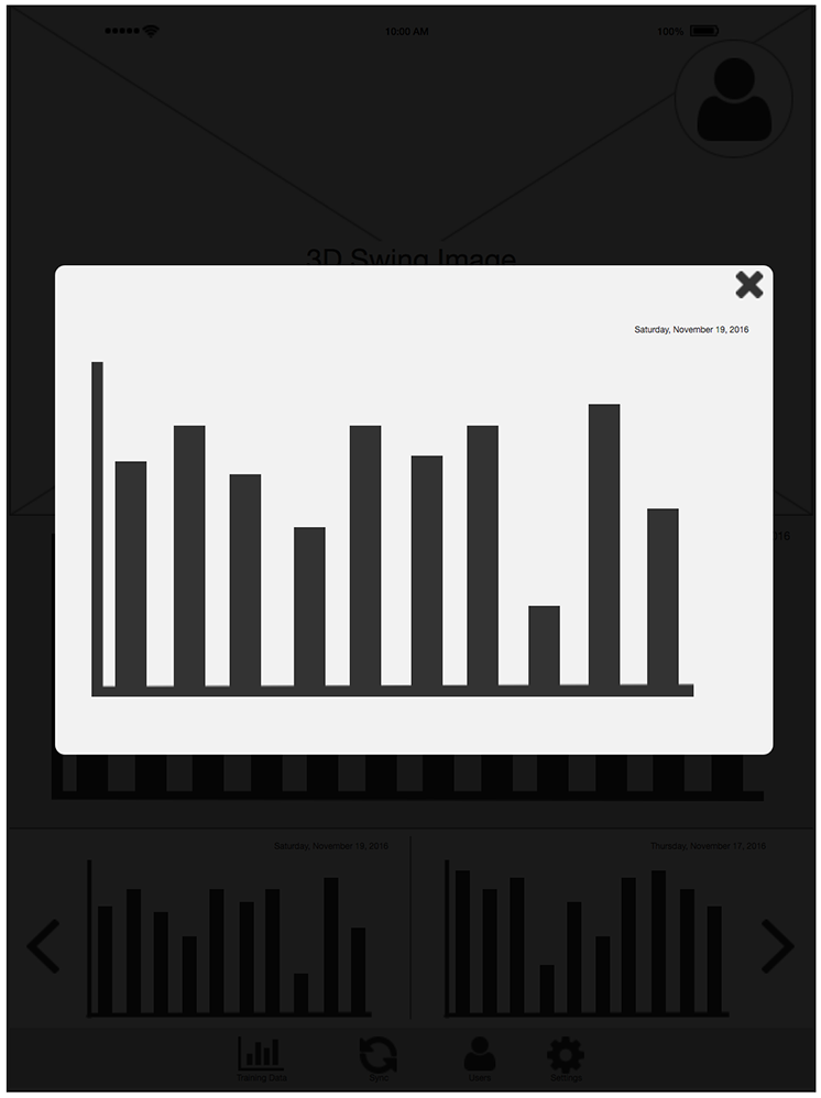
- Wants a way to make the data image bigger
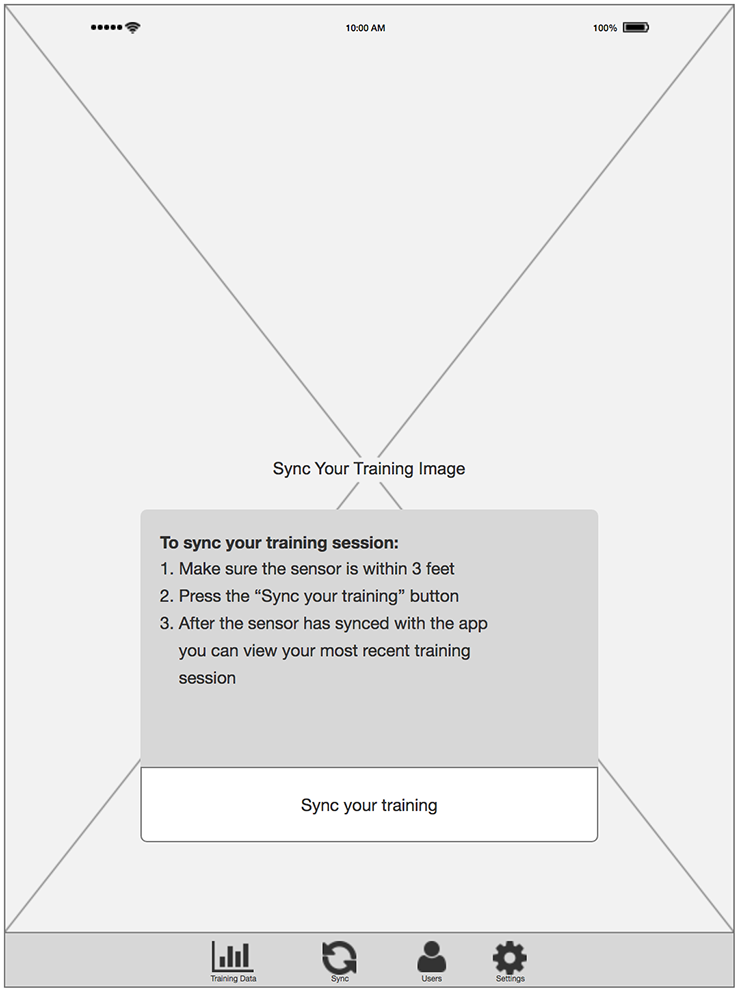
- Not sure what sync training means
- Needs to have a clear way on how to add/delete users
- Maybe add name of team(s) on the profile page
- Name of the user instead of profile image
Critique:
App
- Wonders about how long the battery would last
- Would the sensor break if the ball hits the sensor
Sensor
Personas & Experience Map
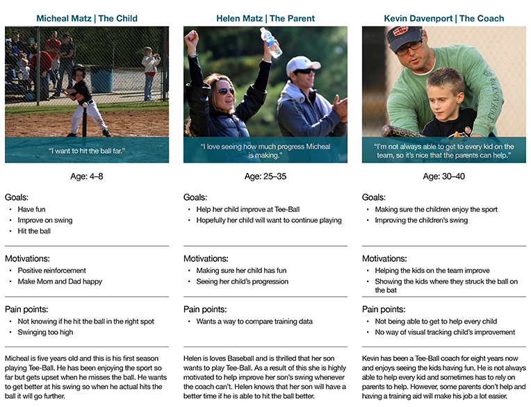
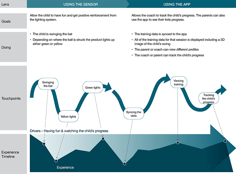
Once we had an understanding of what our users wanted and who they would be, we began developing personas for each user category: The Child, The Parent, and The Coach. Next, an experience map was created.
Wireframes & Prototype
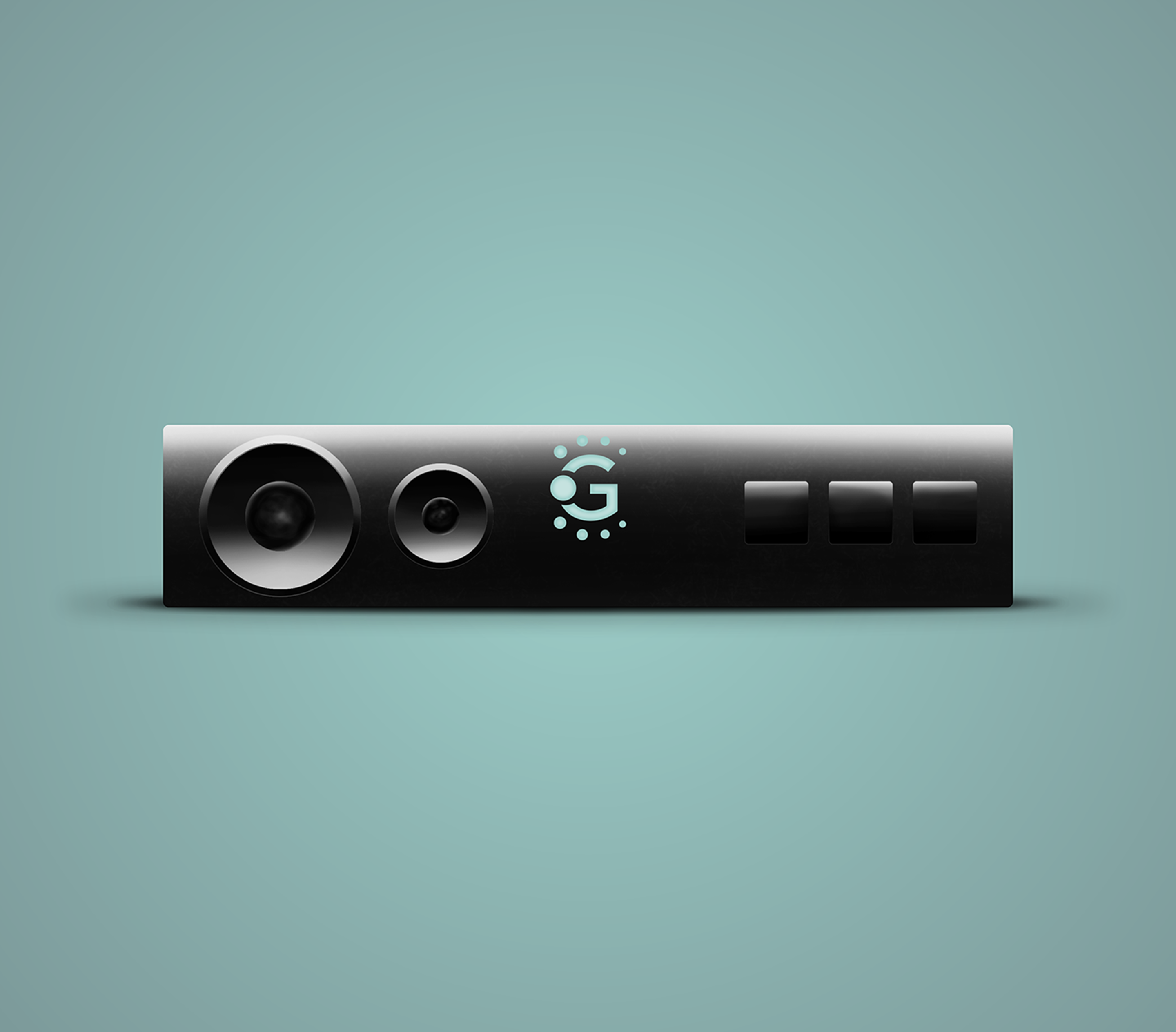
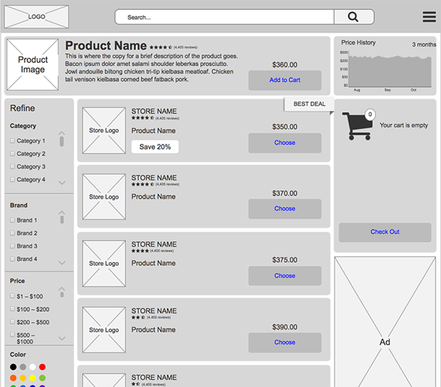
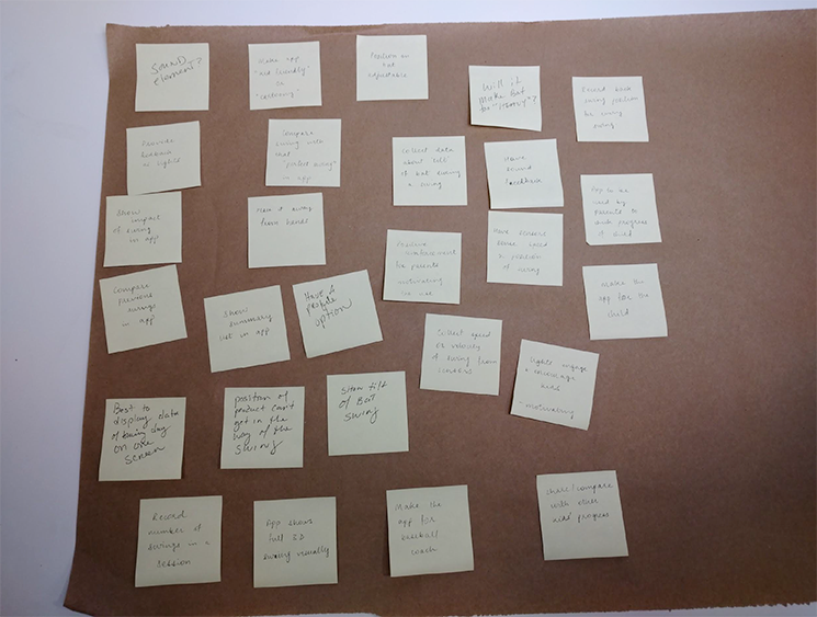
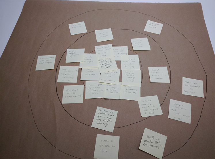
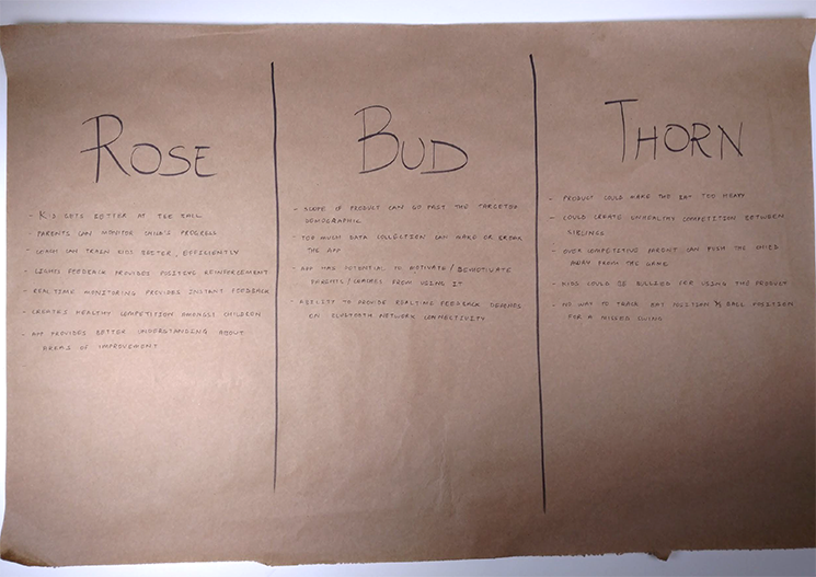
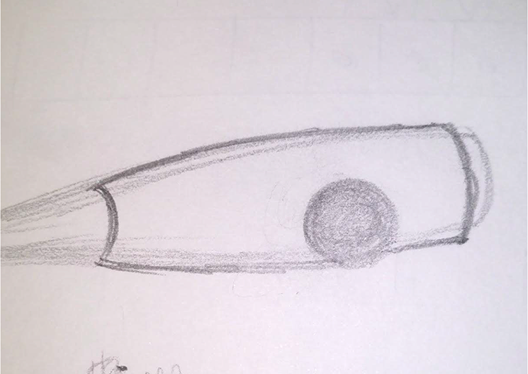
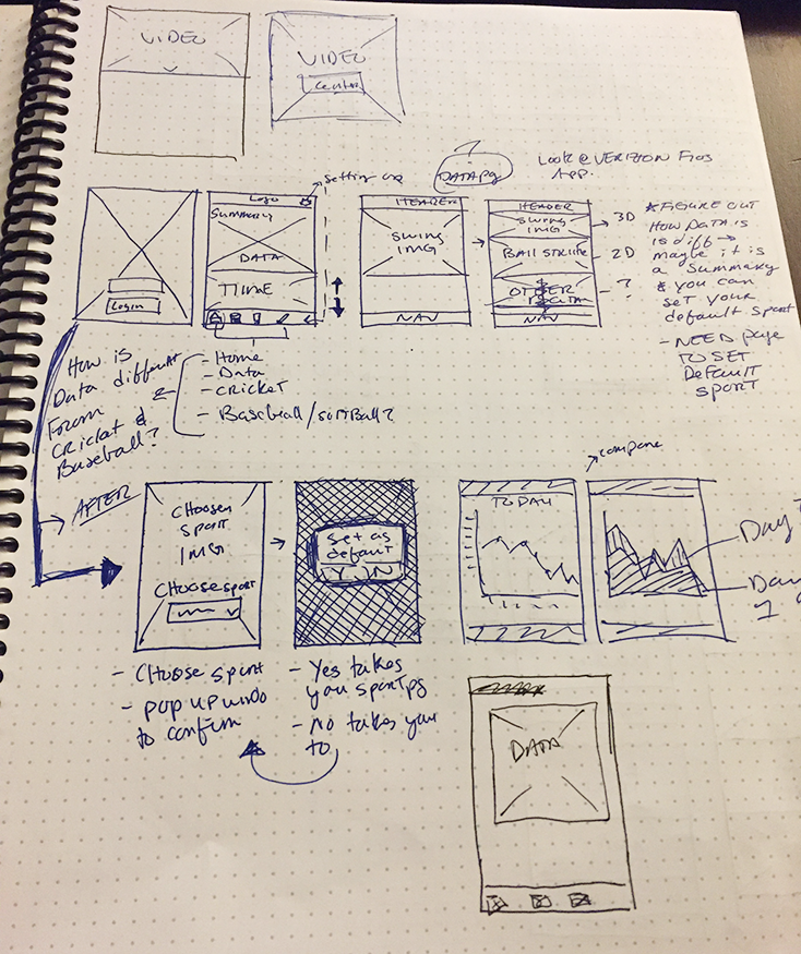
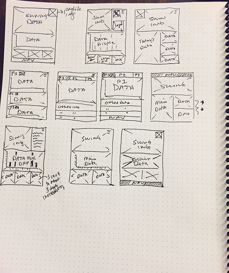
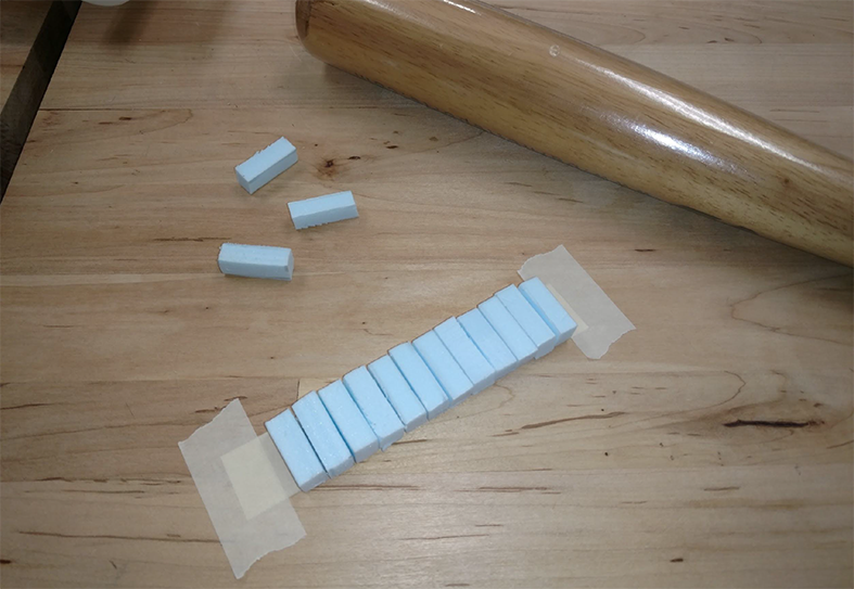
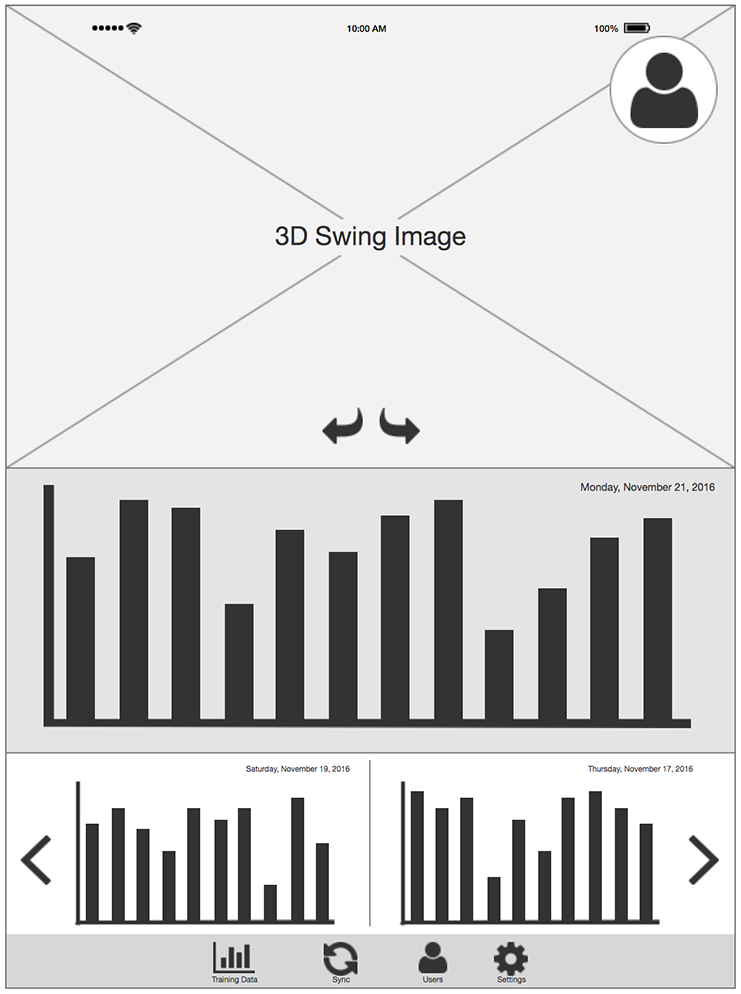
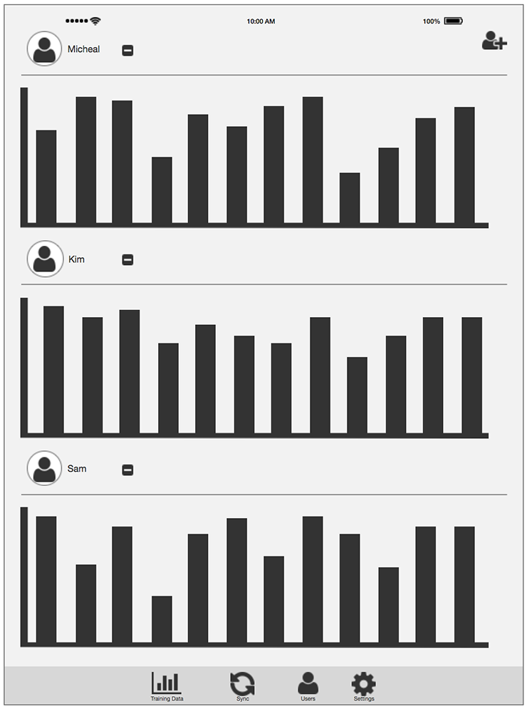
Combining other research methods such as Affinity Clustering, Bull's Eye Diagraming, thumbnail sketches for the sensor and app, and storyboards of how both the sensor and the app will be used, we were able to begin wireframing the app and create 3D renders and physical prototypes of the sensor.
Affinity Cluster
Bull’s-Eye Diagram
Rose, Bud, Thorn
Sensor Sketch
Wireframe Sketches
Prototype Renders
Prototype
Wireframes
Summary
Understanding various research methods is critical for Human-Centered Design. By using three design skills, Looking, Understanding, Making and the different techniques for each, it allows for multiple iterations and fast prototyping. By combining these methods with proper planning, our team was able to take a project from concept to prototype in only a few weeks. Future steps would include further iterations on the design and development of the app and the sensor.
