Interacting with Data
A study on how to visualize data in an engaging way
Overview:
The concept was simple, find a way to help people of low-income become entrepreneurs. Out of that concept, an idea was born—design an application that gives people with low-income a microloan so they will be able to start a small business within their community.
My Role:
Conduct user research interviews, develop wireframes, and conduct user testing for the wireframes and UI mockups.
Tools:
InDesign CC and Axure RP Pro

Discovery Phase
Working with another UX designer, Aditya Motupalli, we knew that we wanted our users to be people who aspired to help their communities. That is why we used a dataset from OpenDataPhilly that showed areas in Philadelphia that are certified for redevelopment by the Philadelphia City Planning Commission.
We wanted to know what people who wanted to start a small business would need, and how people who had a small business were able to succeed. With those guidelines set, we interviewed ten people, five people who wanted to start a business and five people who had a successful business. From our research, we discovered that the main thing people needed is funding, followed by how important location is, a passion for the business, and finding the right customer base.
Persona
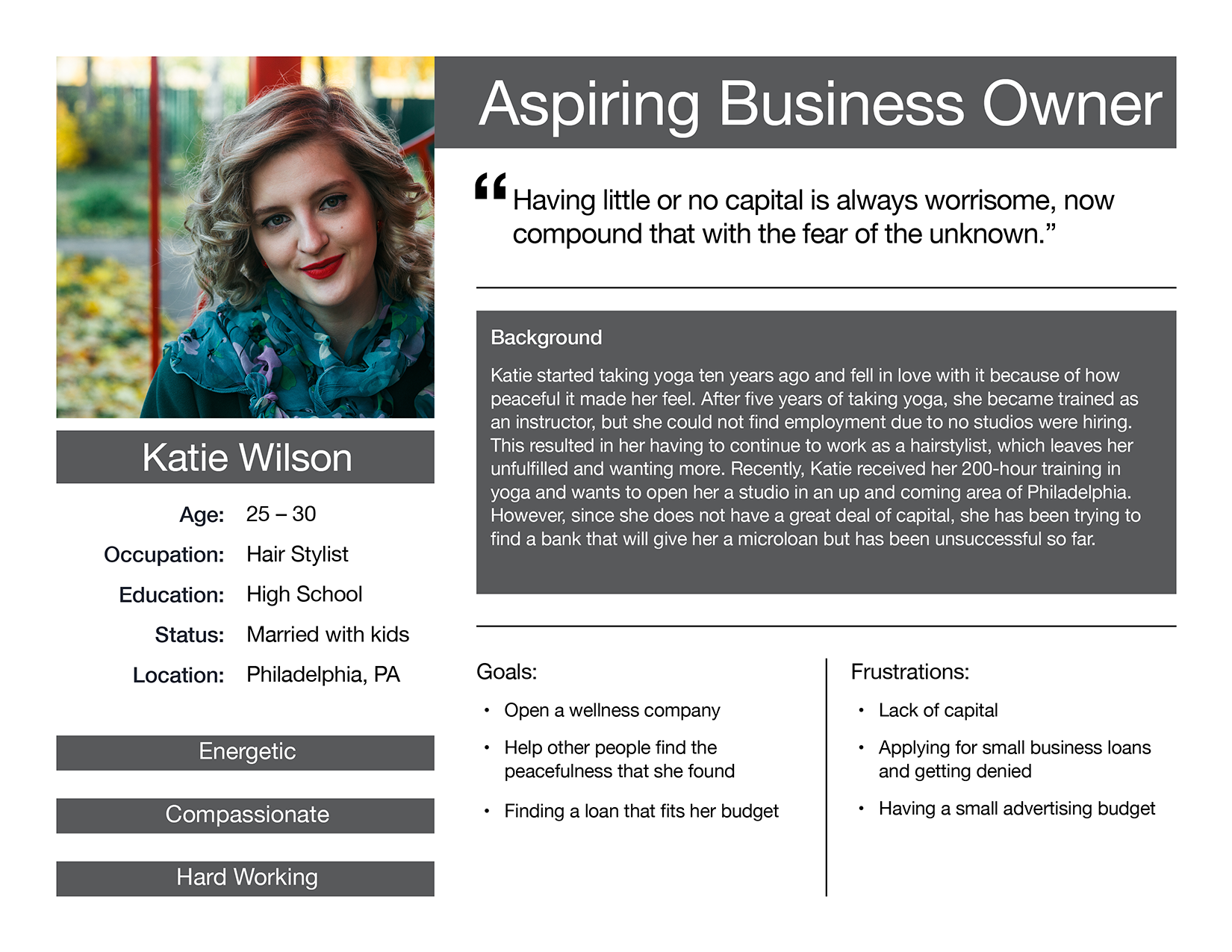
Taking the dataset and combining it with our user research we came up with an idea for an application that offers microloans to people who want to start a small business in one of the certified areas in Philadelphia. Through our findings, we knew there was a need for our product and were able to develop a persona that reflected our desired user.
Feature Maps & Wireframe
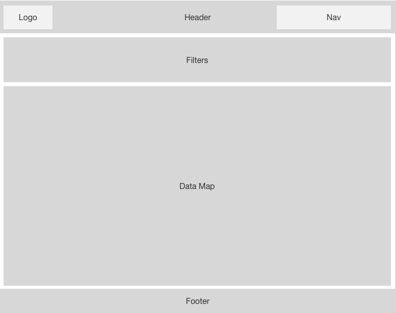
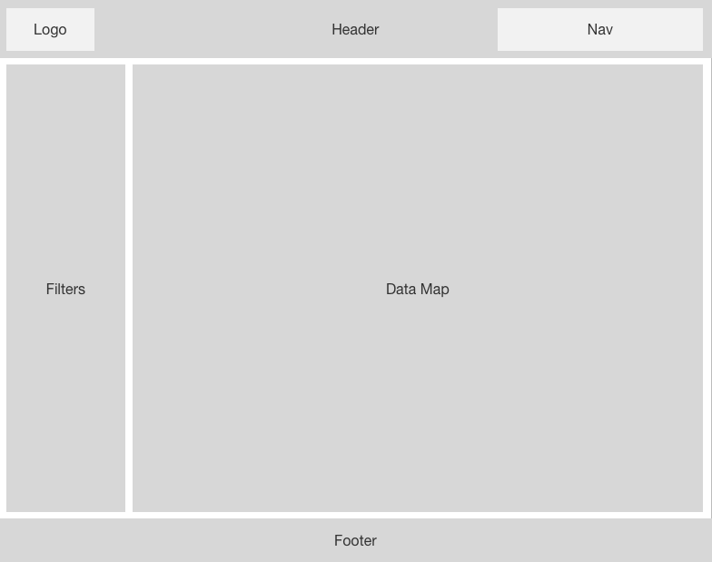
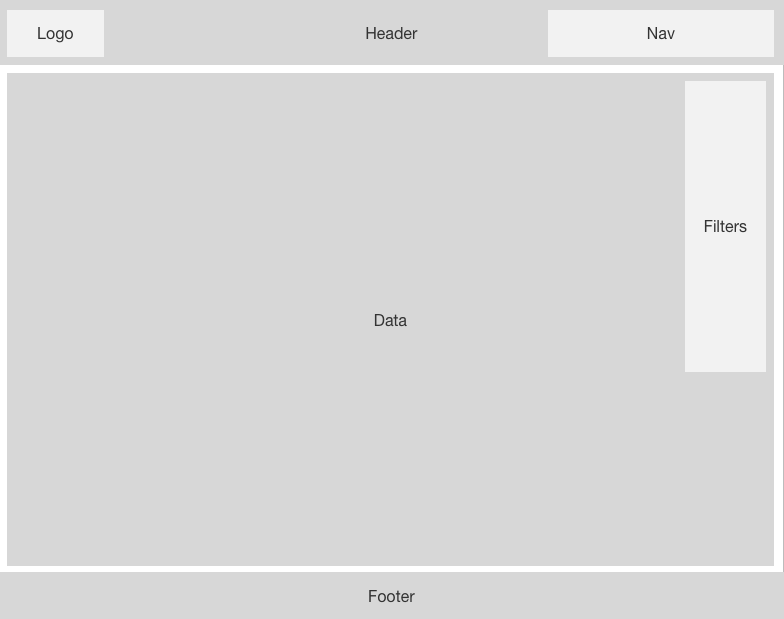
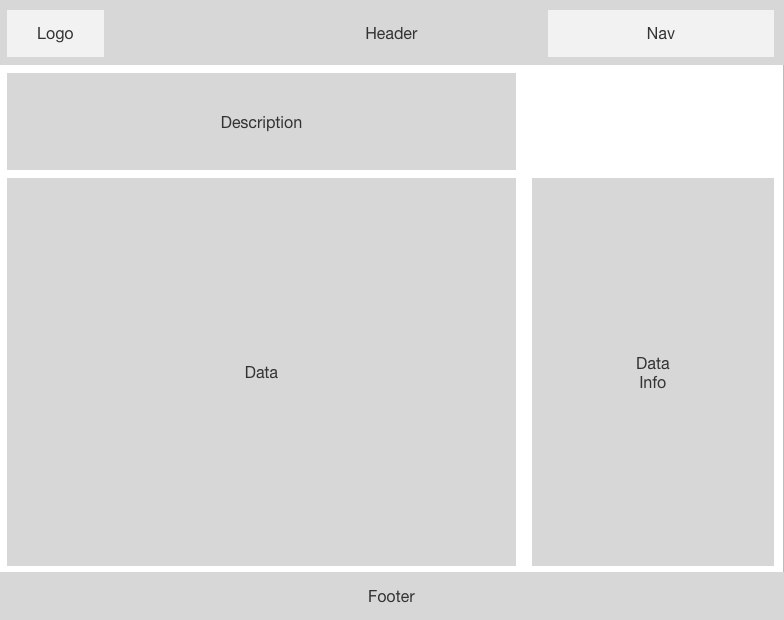
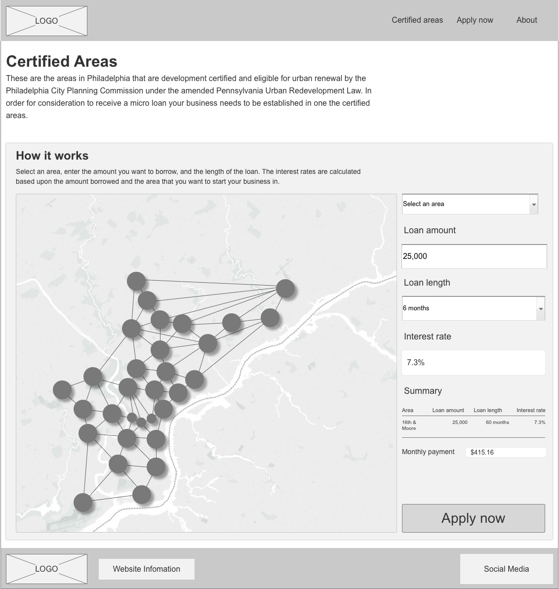
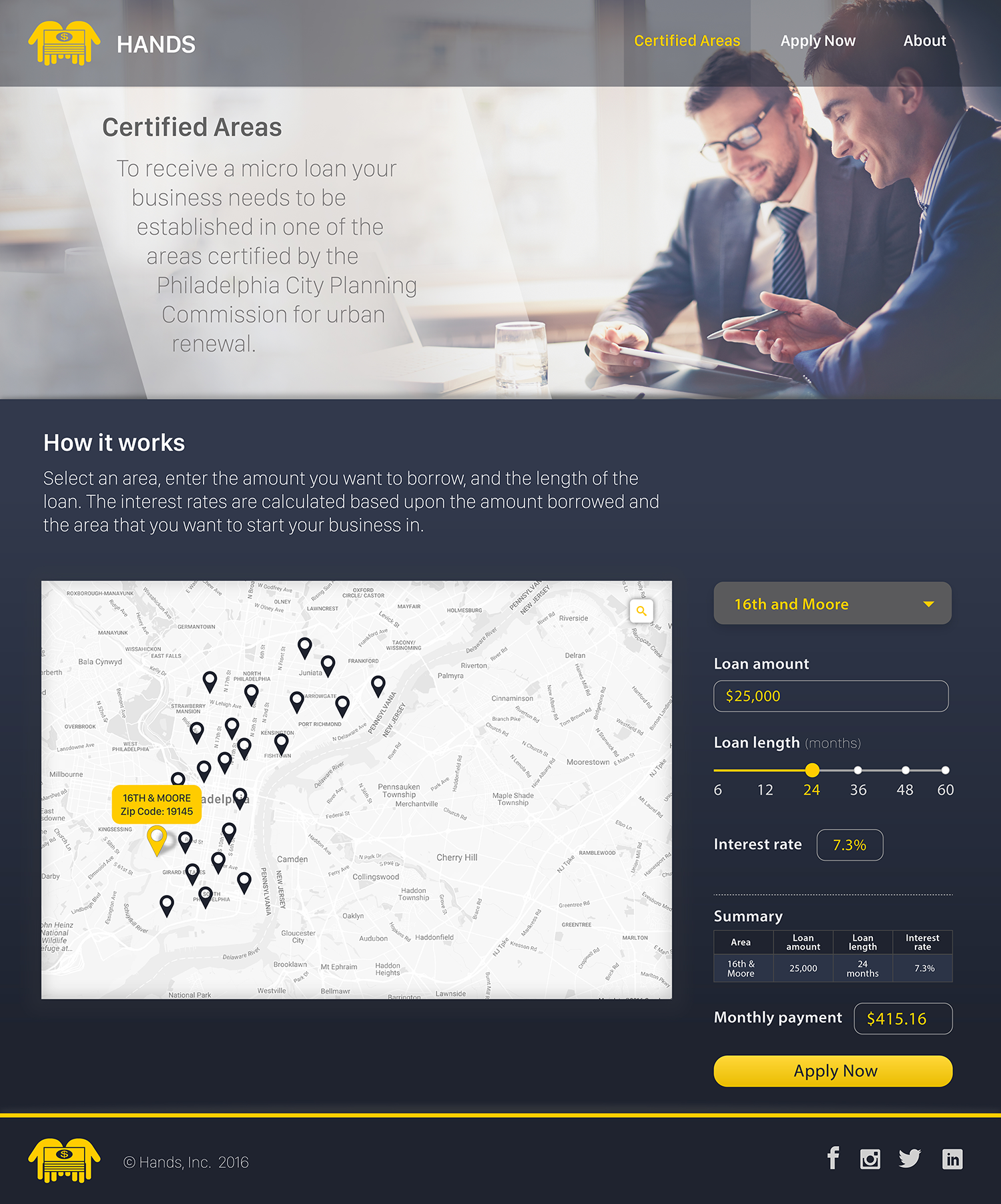
Our next step in the design process was to fleshing out the wireframes by working through the different features users will need. We worked out the desired series of steps that we wanted the user to take. The user selects an area and puts in the desired amount they wish to borrow, up to $50,000. Then, based on the selected area and the loan amount, the interest rate gets calculated and shown to the user. After that, the user chooses the desired length of the loan, and then they can see what their monthly payment is. If everything is correct, the user can apply for the loan. From these series of steps, we created feature maps to work through the various design issues. Once we landed on the placement of the features we liked, we moved on to wireframing the application and then user testing the wireframe.
Feature Maps
Wireframe
Visual Design
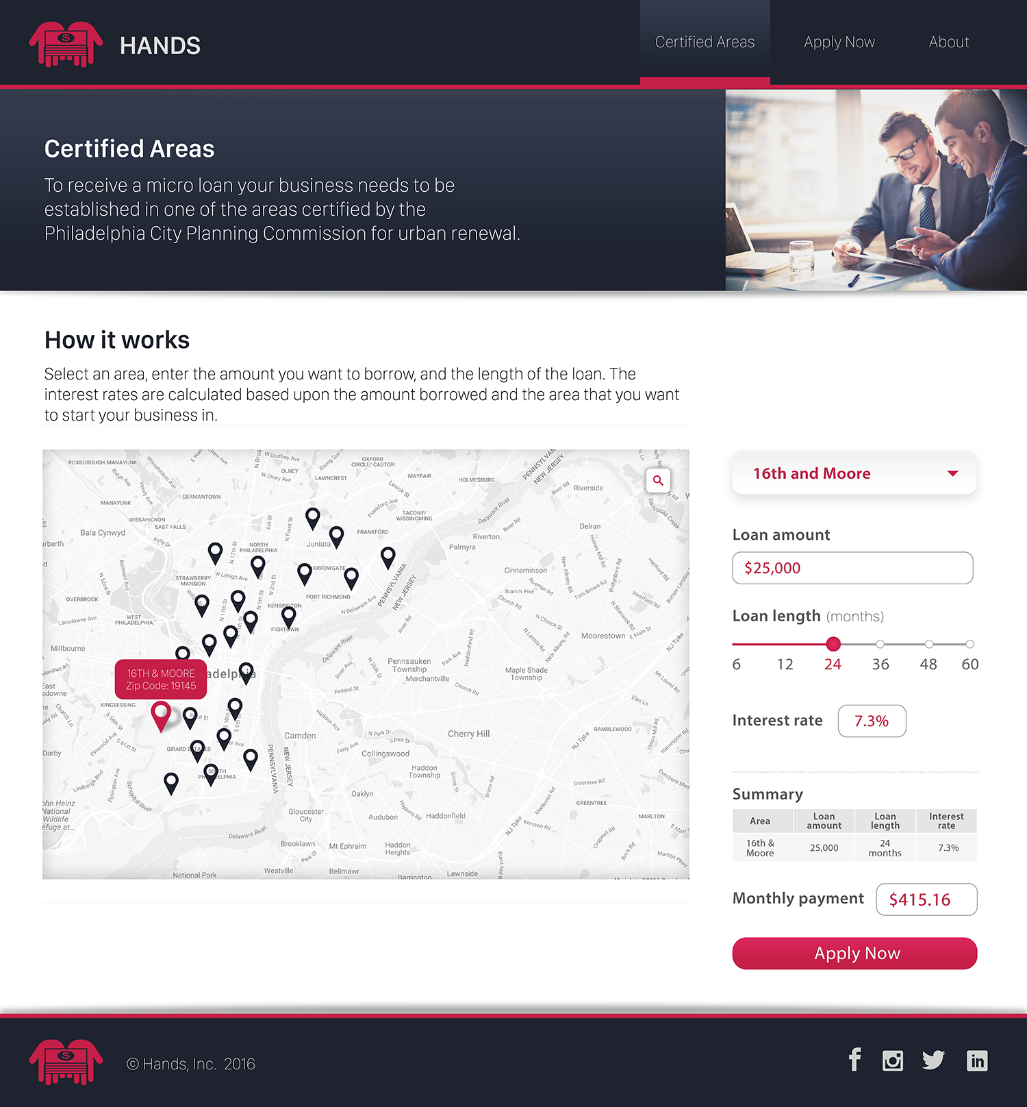
The visual design was completed by Aditya Motupalli, who took the wireframes that I had developed and the findings from the user testing sessions and designed the IU mockups. Once the mockups were designed, they went through a round of testing as well.
Concept One
Concept Two
Summary
Throughout this whole process, some questions came to light. How do low-income users access the internet? Do they only use mobile devices, or only computers, or both? The answer impacts the design of the application and how users interact with it. Future endeavors require more user research and prototyping.
User Testing
- The general purpose of the page was easily understandable through the wireframe and the visual designs.
- The description of the Certified Areas needs work. As well as, the How It Works description.
- The colors for both visual designs were liked because they gave the design a corporate and trustworthy feel.
- People liked the second design concept the most because it is more on trend with websites seen today.
- Everyone thought that the change in the loan length was a great way to represent the length of the loan.
