Task Flow Redesign
A study on how people buy an item off the Internet
Overview:
The task flow redesign objective was to gather user research on how users complete a particular task. From the information learned we had to redesign a section of the flow to solve for any pain points the user may encounter.
My Role:
Conduct user research interviews and develop wireframes.
Tools:
InDesign CC and Axure RP Pro
Discovery Phase
The parameters of the project were we had to have the users start with an open browser. From there they had to perform the task that we decided for them. The task chosen was how do users buy an item off of the internet. We began by interviewing ten users and had them walk us through their process. The next stage in our research was defining the user's flow. For this, the data from the user interviews was analyzed and reconstructed into an affinity diagram to make sense of the data using color-coded Post-Its. To summarize our findings and create a more natural understanding of data for analysis, we designed the user's task flow from start to finish.
Affinity Diagram

Task Flow

Persona
From this research, we discovered that a specific type of user has a particular problem: the user has to search multiple sites to find the best price. This issue creates a bad experience for users because they have to go from site to site trying to find the best price. It is this problem that we want to solve. We recognize that this is a problem that many users have, and by addressing for one type of user, we hope it will alleviate the problem for the others. Our research uncovered a group of users, that we identify as, The Economical Shopper.

Feature Maps & Wireframe
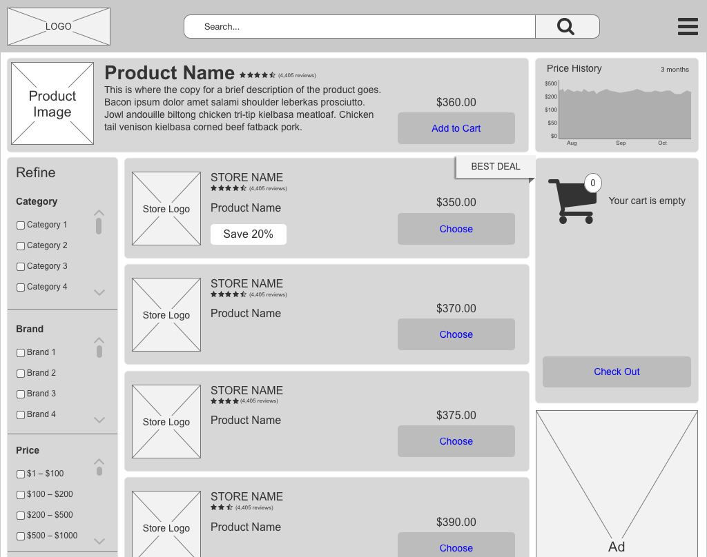
After understanding who our users would be the next stage was how do we solve their problem? The question came down to what features do users need? That is where we came up with the idea of a single site where the user can get up-to-date prices and not have to navigate from site to site. We know that users need filters to narrow down the search results. The product needs to be displayed. There needs to be a cart in case the user wants to buy from our site. There has to be an area for advertisements. Finally, what will sell this to our users is a section where the user can see if the competitors have a better price.
Feature Maps


Our solution is a site where users can choose to buy from us directly or buy from another store, which might have a better deal. The deals are calculated by which store has the best price and the best customer reviews. The deals are updated in real time, allowing the user to know if they are getting the best deal, all the while satisfying our user's highest motivation. An added feature is the price history. The price history shows the price of the product over the past three months. The user can hover over the chart to see the cost of that item for that particular day. It is these price trends that users are concerned with because it validates the best deal and assures that the users are getting the best price for that product.
Wireframe

Summary
We tried to solve for only one type of user, more research needs to be done to address any problems the other types of users will encounter. Our next steps are to conduct user tests and develop high-fidelity UI mockups.
